HealthHub: Bridging the Age Gap in Digital Healthcare
A look into HealthHub and efforts to craft a simpler, more intuitive way for users to manage appointments, prescriptions, and medical records.
Task
User Research, Usability Testing, User Flow, Wireframing & Prototyping
-
Design
UI/UX Design, Case Study
-
Role
UX Designer & Researcher
HealthHub: Bridging the Age Gap in Digital Healthcare
A look into HealthHub and efforts to craft a simpler, more intuitive way for users to manage appointments, prescriptions, and medical records.
Role UX Designer & Researcher
Scope User Research, Usability Testing, User Flow, Wireframing & Prototyping
Disclaimer: This is an independently led project and is not affiliated with HealthHub, or team associated with the product.
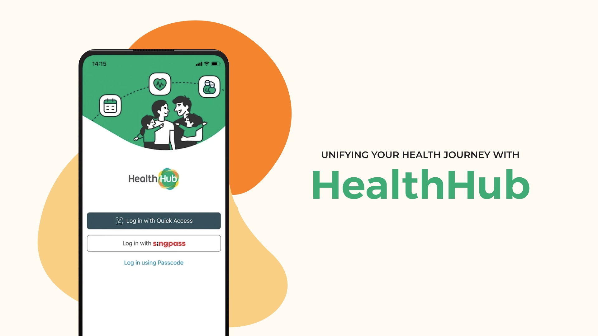
HealthHub - The Pinnacle of Modern Healthcare Management
HealthHub is Singapore’s national healthcare app, launched in 2015 by the Ministry of Health and the Health Promotion Board. It was designed to be a centralised digital platform for citizens to manage a wide range of healthcare services—such as appointment bookings, pre-appointment check-ins, prescription refills with home delivery, payments, and access to medical records across public healthcare institutions. It was part of a broader national push toward a smarter, more efficient healthcare system—reducing reliance on paper processes and long queues across polyclinics and public hospitals alike.
The Age Gap in Healthcare UX

From my observation, for older adults using HealthHub is often like being handed the keys to a state-of-the-art healthcare complex—filled with features meant to improve their wellbeing—only to find the elevator broken. They’re left taking the stairs. Slowly. And often never making it far enough to use what’s inside.
And yet, these are the very people the system was meant to support most.
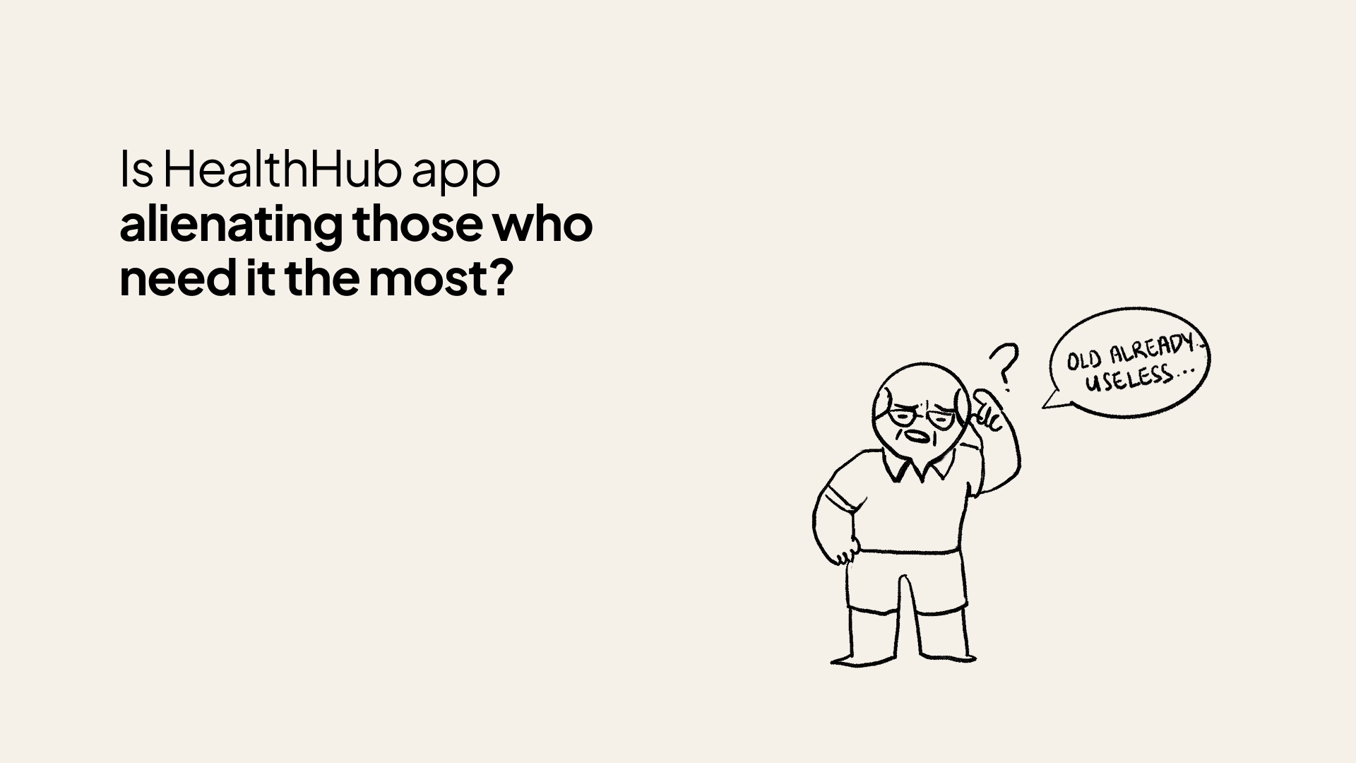
Many seniors, including my dad, blamed themselves—labelling their struggles as “technophobia.” But that didn’t quite add up.
After all, I’ve seen seniors become highly efficient at using WhatsApp to stay connected with family, Facebook to share updates, and even play games like Candy Crush and Pokémon Go. When technology clearly benefits them, they’re more than willing to engage.
According to IMDA, 45% of seniors in Singapore are willing tech adopters. My own surveys and interviews echoed this sentiment: many are not unwilling—they’re unsupported.
As Singapore rapidly ages—with 1 in 4 citizens projected to be over 65 by 2030—we must ask: is our healthcare system scaling accessibility as quickly as it’s scaling innovation?
HealthHub was built for the masses. But without inclusive design, it unintentionally locks out those who rely on our healthcare system most.
Insights from the Ground Floor
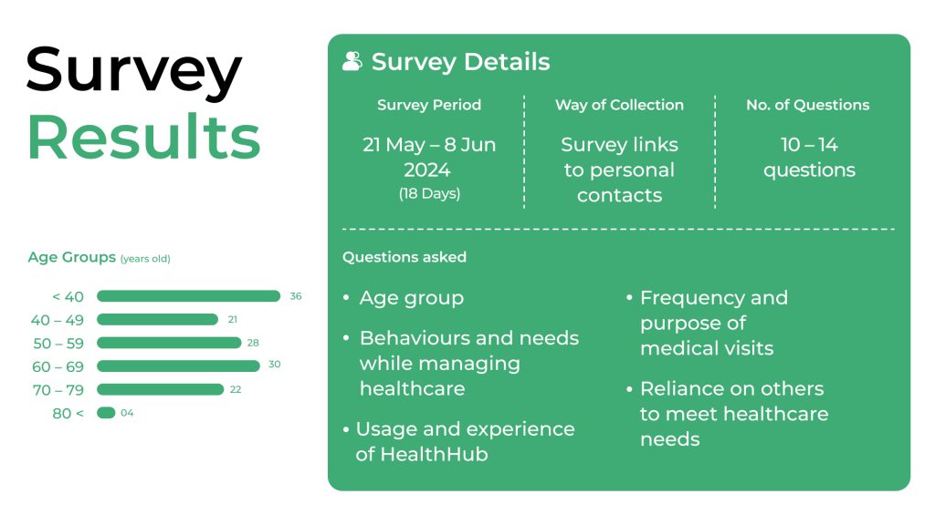
To understand why older adults were disengaged from HealthHub, I collaborated with three like-minded individuals focused on accessibility for seniors. Together, we conducted:
- A survey with 141 respondents, including 60+ seniors
- In-depth interviews with 10 older adults aged 60–79
- One stakeholder interview with a HealthHub product team member to understand internal perspectives and constraints
Independently, I also conducted secondary research through online forums, app store reviews, and Google feedback to identify commonly reported pain points and recurring frustrations.
While HealthHub was built to streamline healthcare, our user research surfaced three recurring themes behind its limited effectiveness for older adults, alongside broader organisational considerations around resourcing and prioritisation.
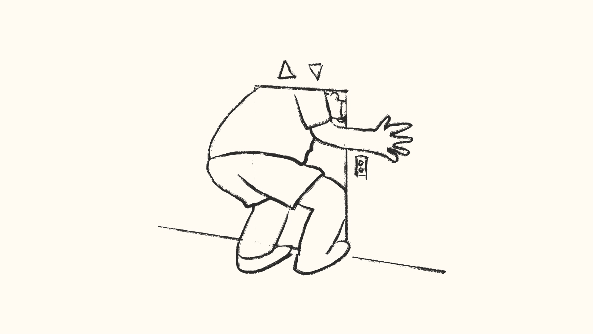
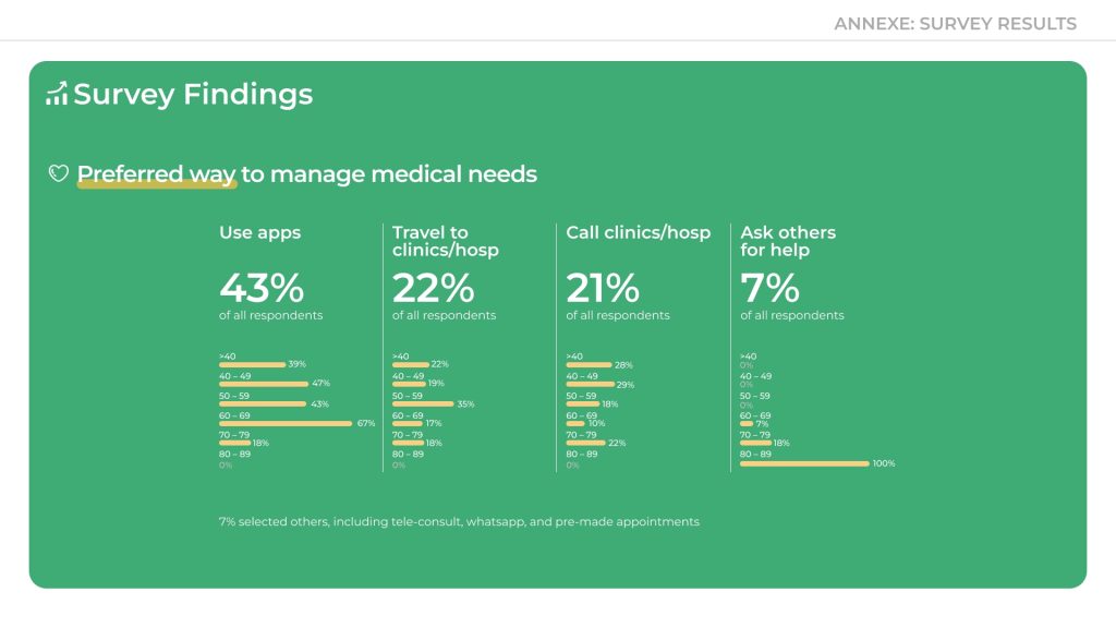
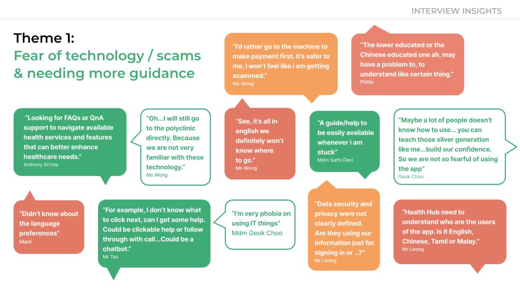
01. It's not technophobia—it’s a trust gap
Older users didn’t reject technology outright—they lacked the guidance and reassurance needed to use it with confidence. In a digital environment where the fear of making irreversible mistakes is amplified, particularly around payments, many seniors defaulted to safer alternatives.
This hesitation is also shaped by Singapore’s highly visible national campaigns on scam prevention. With constant reminders to “stay vigilant,” older adults are especially cautious when digital interfaces feel unclear or unverified.
“I’d rather go to the machine (kiosk in the clinic). I won’t feel like I’m getting scammed.”
– Ms Wong, 72“For example, I don’t know what to click next, can I get some help. Could be a clickable (in-app) help, a follow-up call (from the staff)… or even through a chatbot.” – Mr Tan, 65
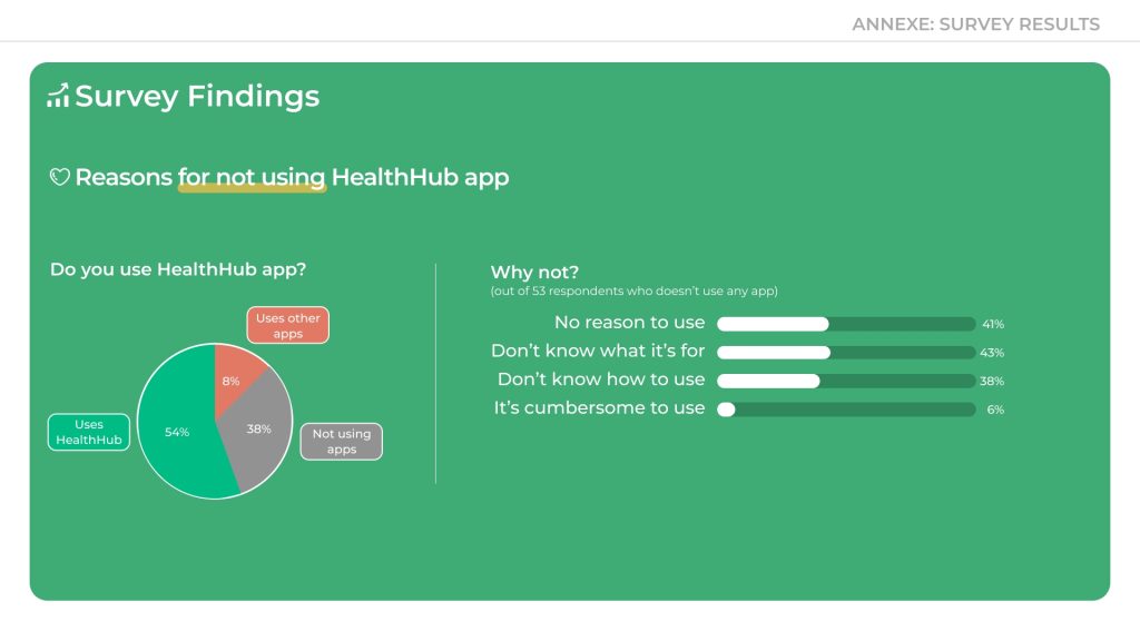
- 38% of non-app users said they didn’t use HealthHub because they didn’t know how
-
80% of interviewees said they lacked confidence and needed more guidance
🛠️ Design Note: Guidance Exists—But It’s Passive
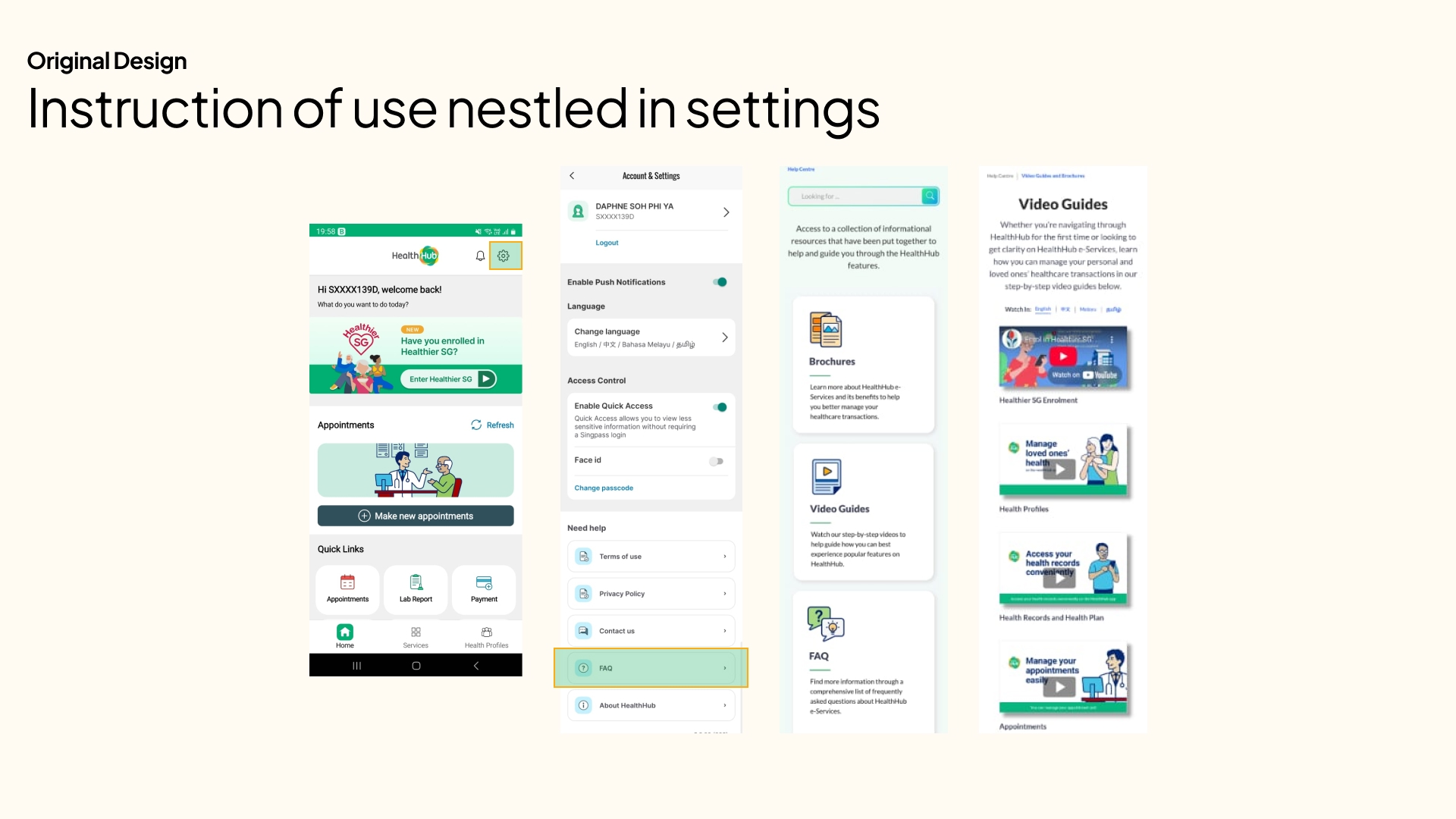
While instructional content like video guides and FAQs are available in HealthHub, they’re buried within the settings and require users to actively seek them out. For older adults, this passive form of help isn’t enough.
There is little to no just-in-time guidance—such as tooltips, contextual prompts, or onboarding walkthroughs—that supports users while they’re in the middle of a task.
Why it matters:
Without timely cues or visible support, seniors are left second-guessing their next steps—especially during high-stakes tasks like booking or payment.
Design Opportunity:
Introduce contextual help elements like onboarding modals, micro-copy hints, or floating tooltips at key action points to support decision-making and build confidence.
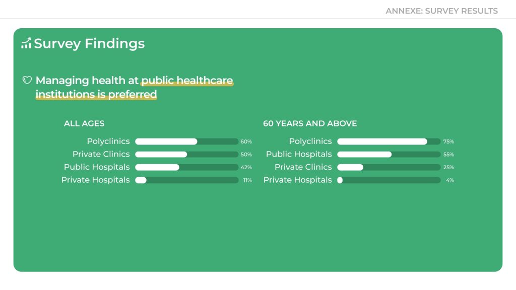
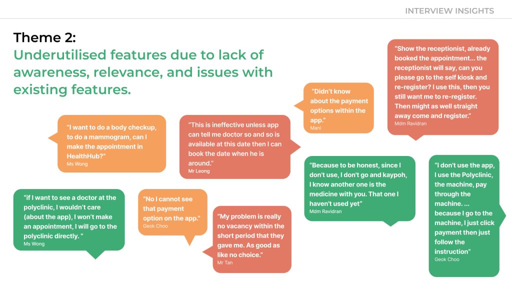
02. Underused features, hidden in plain sight
Even when helpful features existed—like medication refills or appointment bookings—many seniors didn’t know about them, or didn’t see their value due to poor discoverability, unclear labels, or relevance gaps.
“Didn’t know about the payment options within the app.”
– Mani, 71
“This is ineffective unless the app can tell me doctor so and so is available at this date then I can book the date when he is around.”
– Mr Leong, 68
“See, it’s all in english (as mandarin speakers) we definitely won’t know where to go.”
– Ms Wong, 72
- 43% of non-users didn’t understand what HealthHub was for
- 41% felt they had no reason to use it
🛠️ Design Note: Incomplete Localisation and Unclear Touchpoints
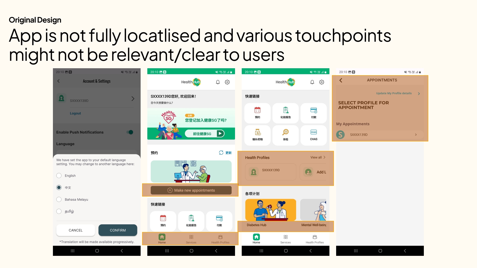
HealthHub offers language preferences such as Mandarin, Malay, and Tamil, but the translation is only partial—leaving users to navigate a mix of English and their preferred language. For seniors less fluent in English, this inconsistency makes the experience feel disjointed and inaccessible.
Additionally, several touchpoints and menu items (e.g., “Mental-wellbeing Programme,” “Add Loved Ones,” or “Healthier SG”) lack clear context or immediate relevance, especially for first-time users. This contributes to cognitive overload and makes navigation more guesswork than guided.
Why it matters:
Inconsistent language use and unclear feature labels erode user confidence, especially among seniors who are already navigating the app with caution.
Design Opportunity:
- Ensure full, contextually accurate translations across all UI elements
- Consider simplifying the homepage layout with clearer, user-tested labels
- Introduce a “First-Time User” view that prioritises the most relevant tasks (e.g., Book Appointment, View Medication)
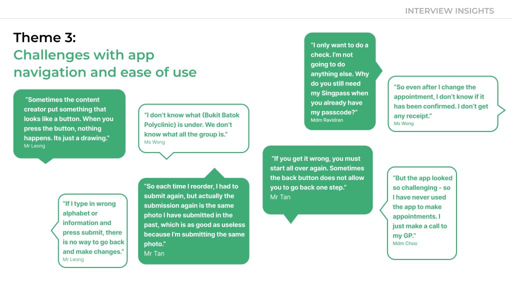
03: Confusing journeys blocked task completion
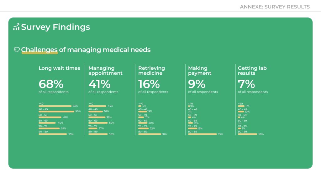
Seniors who attempted to use the app often couldn’t complete basic tasks. Issues like unclear navigation, missing confirmations, poor visual contrast, and non-interactive buttons left them feeling stuck and anxious.
“Sometimes the thing that looks like a button is just a picture.”
– Mr Leong, 68“I don’t know what (Bukit Batok Polyclinic) is under. We don’t know what all the group is.”
– Ms Wong, 72
Repeated friction caused users to abandon the app
This didn’t just cause abandonment—it sent seniors back to in-person alternatives, adding pressure to an already strained healthcare system.
🛠️ Design Note: Redundant Steps and Missed Cues
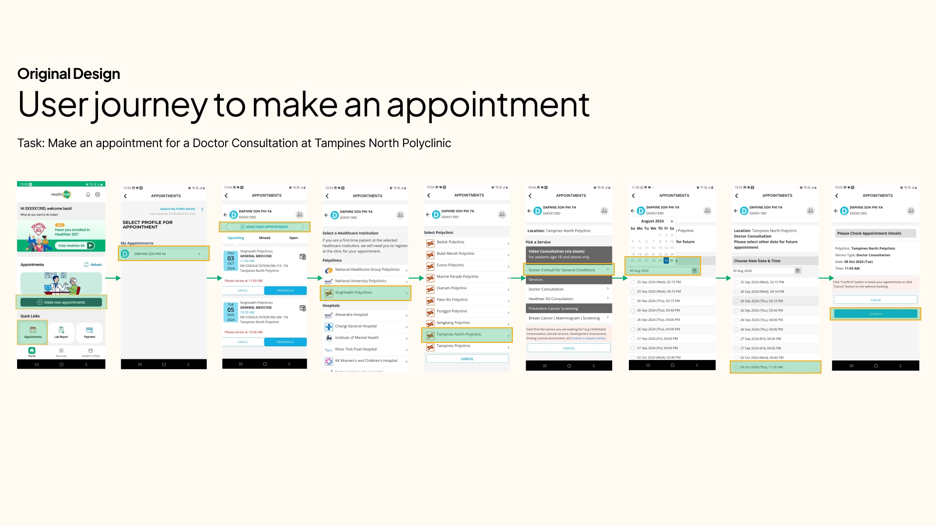
The existing appointment flow in HealthHub is riddled with unnecessary steps and interface redundancies—leading to confusion and task abandonment, particularly for seniors and users with lower digital literacy.
Problem Example
- Both “Appointments” and “Make New Appointment” buttons lead to the same Select Profile screen
- Visual banners are inconsistently used—sometimes as clickable CTAs, other times as non-interactive images, making it hard to distinguish actionable elements
- After selecting a profile, users are shown another “Make Appointment” CTA—adding a layer of repetition
- Users who want to book a new appointment are first shown a list of existing ones, increasing cognitive load
Why it matters:
These repeated frictions derail the user’s intent. For older adults, such inefficiencies often lead to app abandonment—sending them back to call centres and clinic queues, further burdening the healthcare system.
Design Opportunities:
Remove redundant screens and streamline the flow
Clearly differentiate between decorative visuals and actionable buttons
Prioritise relevant actions—if a user clicks “Make New Appointment,” take them directly to the booking process
Improve UX writing to clarify labels and actions, reducing hesitation and guesswork
04. Perceived Low ROI Creates Real Barriers
“It’s hard to justify allocating resources for a small pool of users.”
– HealthHub Product Team
While research revealed clear usability challenges for seniors, I recognised a broader constraint: competing priorities within product development.
A member of the HealthHub product team shared that, given limited resources, it can be difficult to prioritise enhancements for user groups perceived to have lower digital engagement—such as seniors.
However, I still feel strongly that inclusive design isn’t just about serving a minority—it’s about future-proofing the experience for a rapidly growing demographic. Thoughtful improvements for seniors often translate into better usability for everyone.
05. Frequent Technical Issues Erode Trust
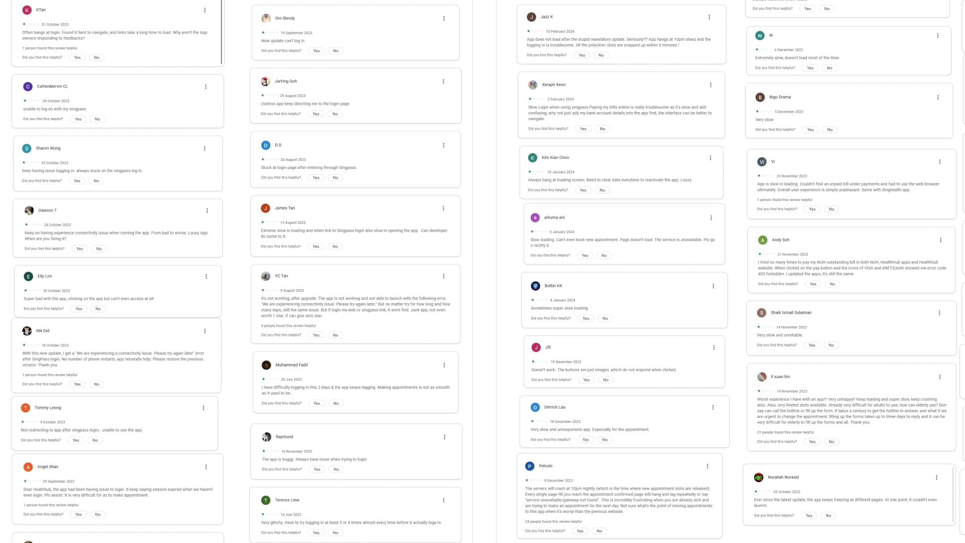
Through secondary research—particularly app store reviews and forum discussions—I observed recurring complaints about app downtime, login errors, buggy form submissions, and appointment unavailability. These issues not only frustrate users but also diminish confidence in HealthHub’s reliability, especially for those already hesitant to rely on digital services for critical tasks.
For a healthcare platform, maintaining system integrity and ensuring optimal uptime isn’t just a technical concern—it’s essential to building user trust and sustaining long-term adoption.
“App is always down or has errors whenever I try to make an appointment. I end up calling the clinic instead.”
– Google Play Store User Review
“Kept getting stuck at loading screen. Tried multiple times and still couldn’t book anything.”
– App Store User Review
Building a Better Way Up
01: Low-Effort, High-Impact On Accessibility Upgrades
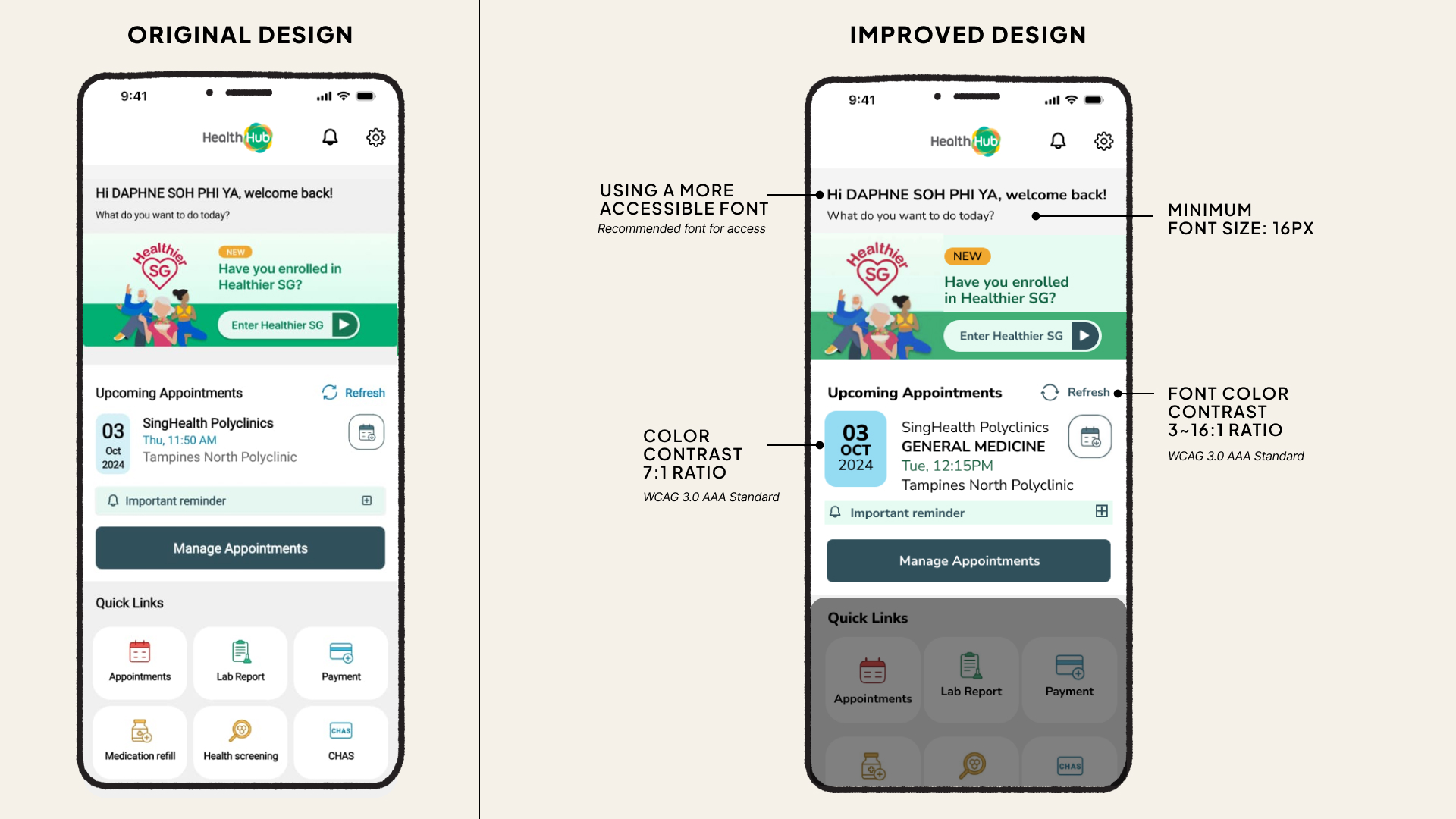
Improving usability without straining resources
Understanding the product team’s resource constraints, I proposed accessibility improvements that deliver outsized impact with minimal development effort. These changes are low-risk, require minimal testing across user scenarios, and can be implemented through updates to the app’s CSS or design system.
What I have Improved:
Increased base font size: to a minimum of 16px for better readability
Standardised font usage: and implemented more accessible typefaces
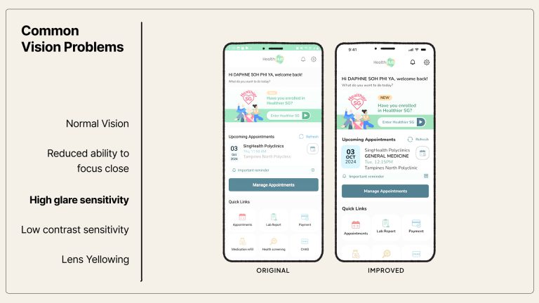
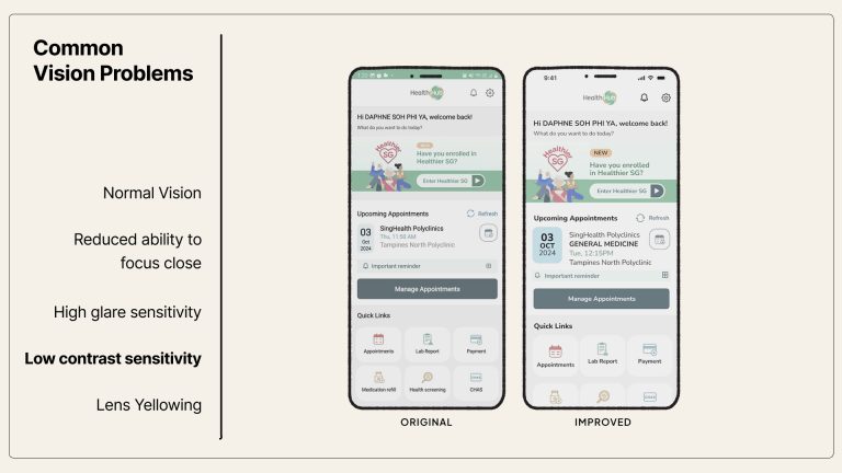
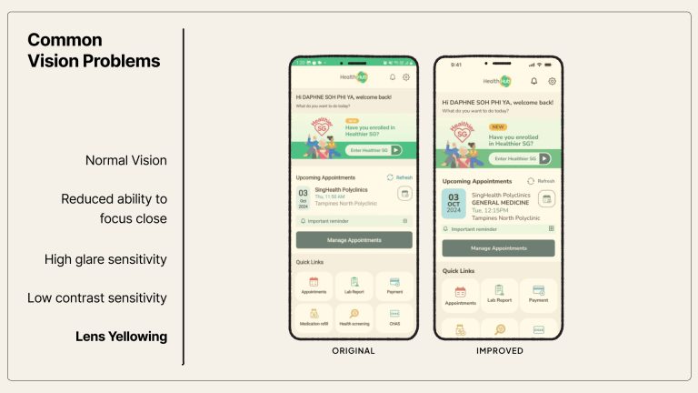
Enhanced colour contrast: to meet WCAG 3.0 AAA (7:1 ratio) for better legibility
Upsized tap targets: with a minimum button size of 44px for easier interaction
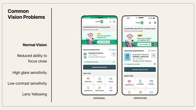
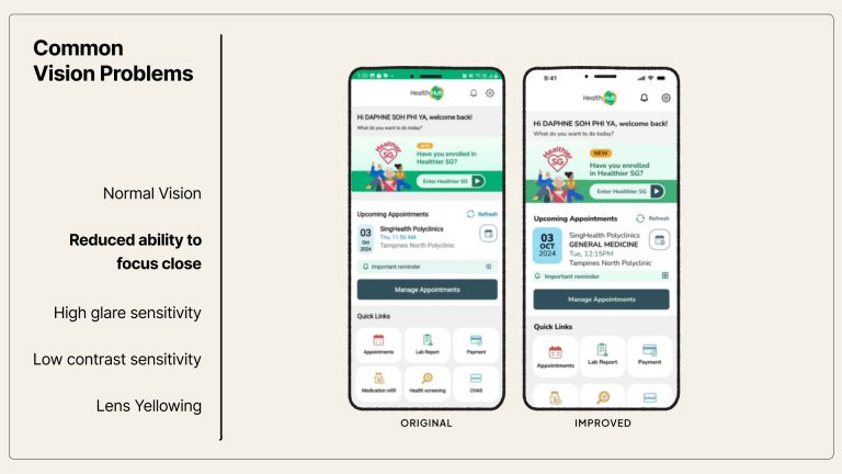
These changes directly benefit users with:
• Reduced visual acuity
• Glare or contrast sensitivity
• Age-related lens yellowing
02: More customisable options for accessibility
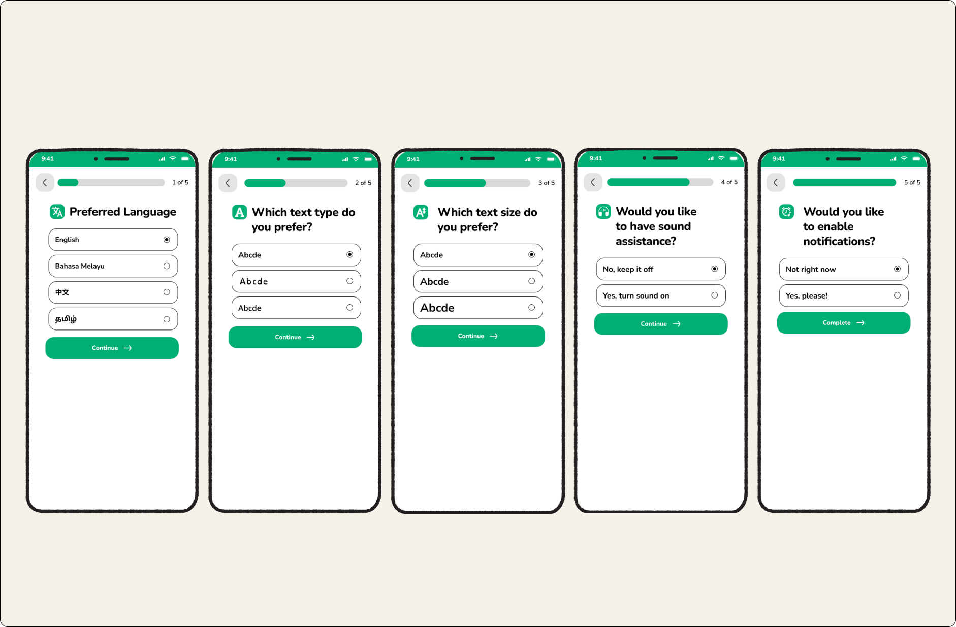
Empowering users with control over how they experience HealthHub
To make HealthHub truly inclusive, I proposed the introduction of personalisation settings that adapt to diverse access needs. These options would be prompted during first-time use, and remain accessible anytime through the app’s settings panel.
Proposed Improvements
Language Selection
Allow users to choose their preferred language upfront—improving accessibility for non-English speakers and those with limited literacy in English.
Font Type Options
Offer a range of accessible fonts, including dyslexia-friendly and clarity-optimised typefaces.
Adjustable Text Size
Let users customise text size to suit their individual visual needs—especially helpful for users with age-related vision changes.
Text-to-Speech & Audio Cues
Enable screen reader compatibility and add optional sound cues for key interface elements to support users with visual or cognitive challenges.
Smart Reminders
Let users opt into reminders for appointments, medication refills, and follow-ups—reducing cognitive load and promoting adherence.
03: Auto-Fill User Particulars
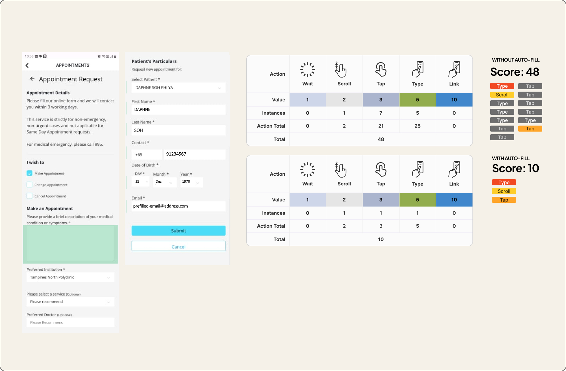
Despite having access to user information via Singpass, HealthHub still requires users to manually fill in their particulars in the appointment request form—a tedious and error-prone experience, especially for seniors.
Proposed Improvement
Enable auto-fill for basic user information using data already retrieved from Singpass. This simple change streamlines routine tasks like appointment booking and form submissions.
By enabling auto-fill, we reduced the user effort score from 48 to 10, as measured by the number of interactions (taps, types, scrolls) required to complete a form.
04: Eliminating friction through smarter navigation and clearer structure
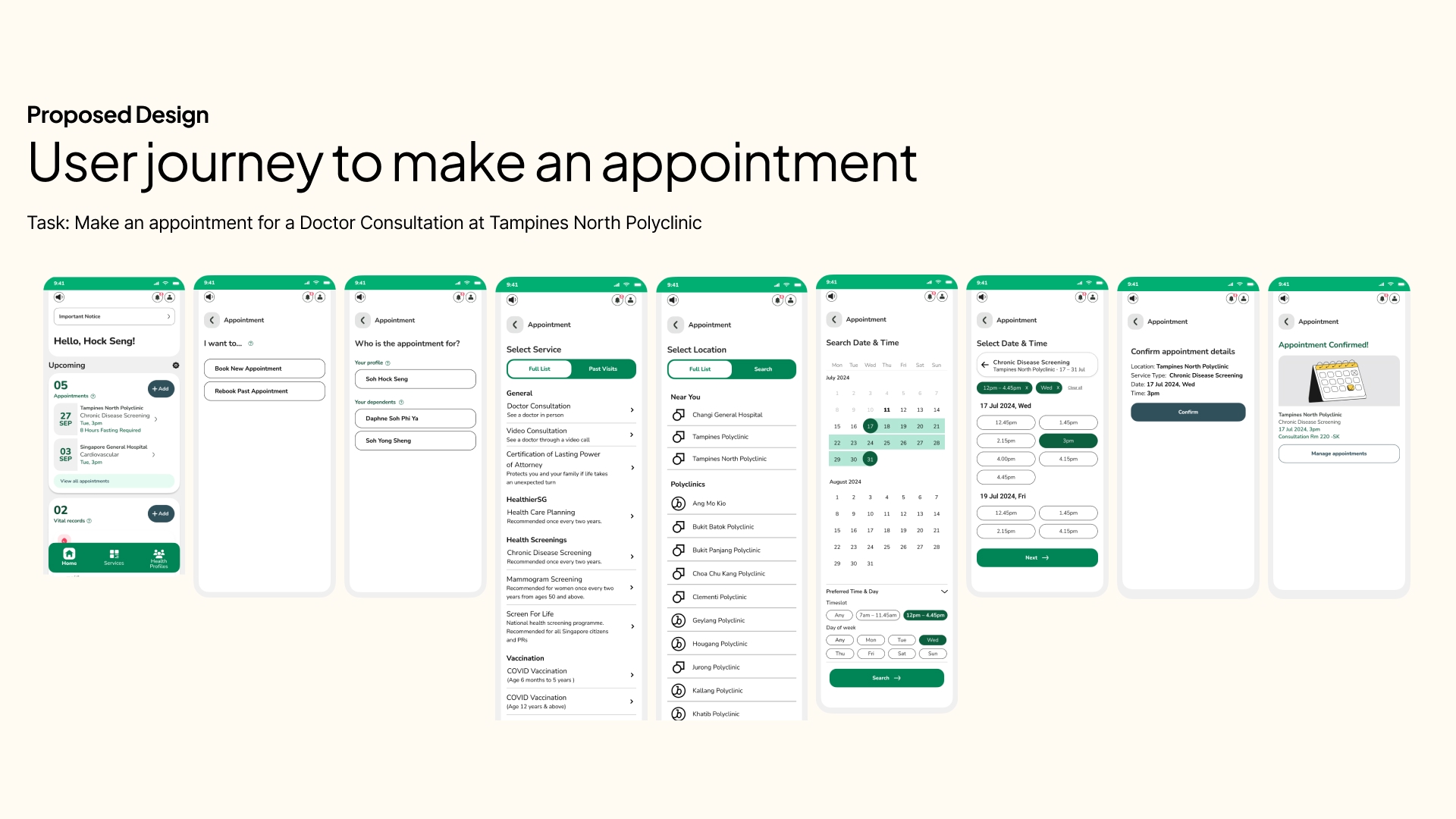
Proposed Improvements
With the redesigned flow and restructured interface, the experience becomes far more intuitive—especially for seniors. Tasks are now grouped meaningfully based on user intent, reducing unnecessary cognitive effort. Users no longer need to re-orient themselves at every step. Instead, important actions are easier to find, quicker to complete, and harder to miss.

1. Redesigned Home Screen Buttons
All homepage buttons now serve distinct, action-driven purposes—eliminating overlapping functions and helping users orient themselves instantly.
Key buttons include:
- Make New Appointment
- Add Vital Records
- View Health Records
This reduces ambiguity and gives users a clear mental model of what each action will lead to.

2. Spotlight Section: Timely Prompts for Key Actions
A new Spotlight Section has been added to the home screen to:
- Highlight upcoming appointments with one-tap access to queue registration
- Display reminders and calls-to-action (e.g. bill payments, vaccination notices)
- Promote health campaigns or relevant updates from MOH
This ensures users don’t miss what matters most—especially on appointment days.
05: Addressing Confusion on the Profile Selection Screen
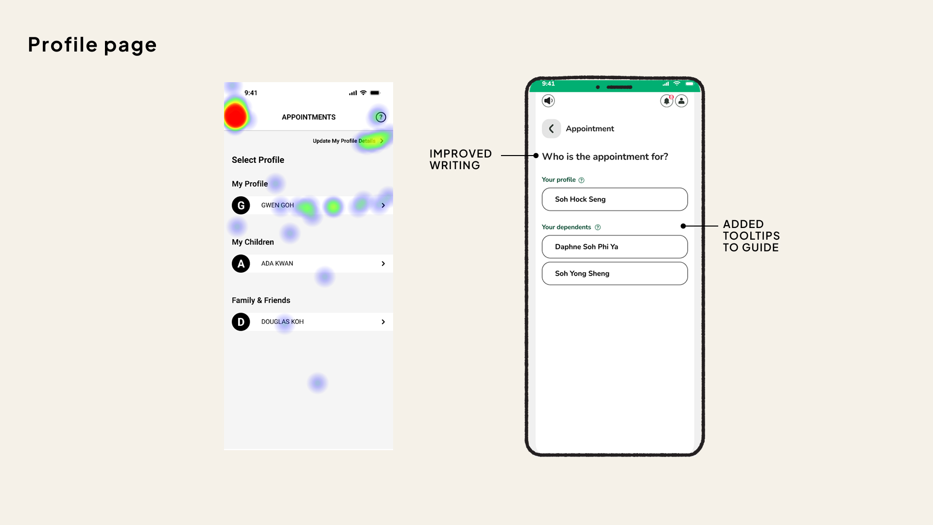
Making intentions clearer through improved microcopy and guidance
User testing revealed that the profile selection screen was a major point of confusion. Heatmap data showed a high concentration of clicks on the back button, indicating that many users were unsure of the screen’s purpose or felt they had navigated to the wrong place.
Proposed Improvements
Improved Title
The screen title was updated to “Who is the appointment for?” to clearly convey the function of the page and reduce cognitive ambiguity.Added Tooltips
Brief, contextual tooltips were introduced to help users make informed selections. These provide just-in-time explanations without requiring users to exit or guess.
Small changes in language and micro-interactions can dramatically reduce confusion—especially for users who are already anxious about using digital tools.
06: Clarifying Services and Supporting Follow-ups
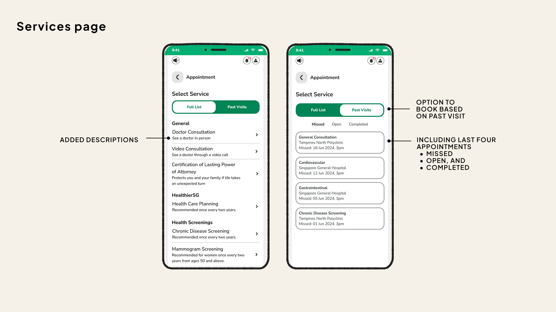
Reducing ambiguity while streamlining repeat bookings
To further support seniors and users with lower digital confidence, we introduced enhancements that clarify service options and simplify the process of booking follow-ups.
Proposed Improvements
Clearer Service Descriptions
Each service now includes a short, plain-language explanation to help users understand what they’re selecting at a glance. e.g.
Doctor Consultation → “See a doctor in person”
Video Consultation → “See a doctor through a video call”Rebook from Past Appointments
Users can now rebook directly from their last four appointments—including missed, open, or completed visits. This eliminates the need to search for services again, making it faster and easier to stay on top of ongoing care.
By making service options clearer and supporting repeat actions, we reduce friction and improve continuity of care—without adding complexity.
07: Smarter Location & Time Selection
Helping users find the right clinic and time slot—faster and with less guesswork
Through usability observations, I identified key friction points in how users search for polyclinics and available appointment times. The redesign streamlines both processes to reduce effort, confusion, and unnecessary trial-and-error.
Proposed Improvements
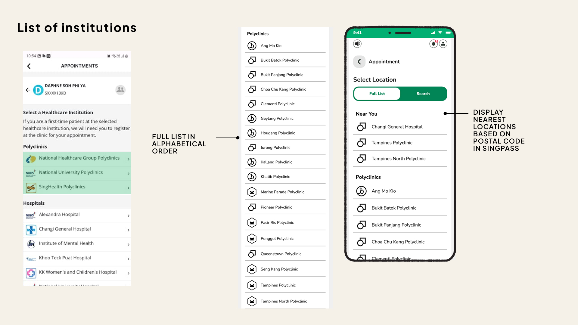
- Alphabetised Locations for polyclinic listings
Previously, polyclinics were grouped by healthcare clusters—a system unfamiliar to many users. This often led to confusion and inefficient browsing.
➤ The list is now organised alphabetically, so users can easily locate their desired clinic without needing to decipher groupings. - “Near You” Feature
A new ‘Near You’ section automatically highlights the nearest healthcare institutions based on the user’s postal code (retrieved from Singpass), allowing quick selection without manual searching.
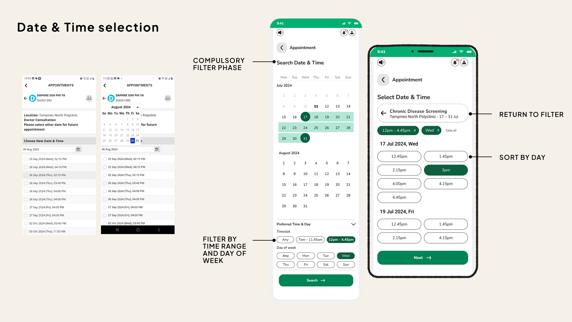
- Date & Time Selection: Filter First, Then Browse
Users are now prompted to select preferred days of the week and time ranges before browsing available slots—helping them quickly narrow results to those that match their schedule. - Easy Refinements
If no suitable slot is found, users can return to their filters without restarting the process, reducing frustration and repeated inputs. - Saved Preferences
The interface allows users to indicate recurring preferences (e.g. weekday mornings), which can guide future recommendations and reduce repeated effort.
By removing ambiguity and aligning the app with natural user behaviour, these updates make the experience faster, clearer, and more intuitive—especially for time-pressed or less digitally fluent users.
Measurable outcomes of inclusive design
If even 30% of seniors—approximately 366,000 individuals—adopt the redesigned HealthHub app, the collective impact could be transformative for both users and the healthcare system. Here is what the potential impact is:
- Reduced Reliance on In-Person Visits
Seniors can manage appointments, medications, and payments from home—enhancing independence and reducing physical strain. - Decrease in Administrative Workload
Fewer phone calls and manual prescription requests free up healthcare staff to focus on direct patient care. - Operational Cost Savings
With streamlined appointment booking and payment flows, healthcare providers reduce manpower needs for non-critical tasks. - Shorter Wait Times and Smoother Patient Flow
Fewer walk-ins mean reduced congestion and more time allocated for meaningful consultations.
Future Considerations
AI Chatbot & Voice Control for Guided Interactions
Looking ahead, I envision:
Conversational task flows through AI-guided voice commands
Screen-free navigation for users with low literacy, poor eyesight, or motor challenges
Natural language prompts that offer comfort and clarity throughout the user journey
These features further reduce reliance on visual-heavy interactions—helping more users complete tasks without fear or friction.
Closing Statement
Designing for inclusion isn’t just good practice—it’s national progress.
By making the app more accessible, we empower more Singaporeans to take control of their healthcare, enabling them to fully benefit from what HealthHub has to offer. This inclusivity helps bring more people to the pinnacle of healthcare management, ensuring that everyone, including those with varying abilities, can access and benefit from the system.