Designing Arrival at Singapore’s National Performing Arts Centre
A public digital kiosk designed to support orientation, discovery, and navigation.
Esplanade sees thousands of visitors daily, but many walk through without knowing what’s on. To change that, I designed the Digital Concierge, Esplanade’s first interactive entrance kiosk.
The work spanned user and stakeholder interviews, usability testing, and physical accessibility considerations, from reach zones for wheelchair users to legibility from five feet away. Two months after launch, internal tracking showed an estimated 15% uplift in brand awareness and visitor dwell time.
Role Project Lead, UI/UX Designer I led the project across problem framing, research, product direction, interaction design, prototyping, and testing.
Scope User Research, Usability Testing, User Flow, Wireframing & Prototyping, Interface Design
BACKGROUND
State of the Arts
Esplanade is Singapore’s national performing arts centre and a public waterfront destination. Many visitors pass through the building daily, yet first-timers often struggle to understand what Esplanade offers on arrival.
I designed the Digital Concierge to change this. It is Esplanade’s first interactive kiosk positioned at the entrance to help first-time visitors quickly understand what the centre offers: free and ticketed performances, exhibitions, dining, retail, and amenities.
The kiosk serves as a simple, warm entry point that encourages visitors to pause, understand the space, and explore further. This transforms casual foot traffic into moments of cultural discovery.
PROBLEM STATEMENT
The business challenge
During early entrance observations and quick interactions with visitors asking for directions, Esplanade often came up as a shortcut to Singapore’s famous icon, the Merlion statue. In those interactions, 7 out of 10 visitors were trying to get to the Merlion and walked through without noticing the performances, venues, or cultural programmes inside.
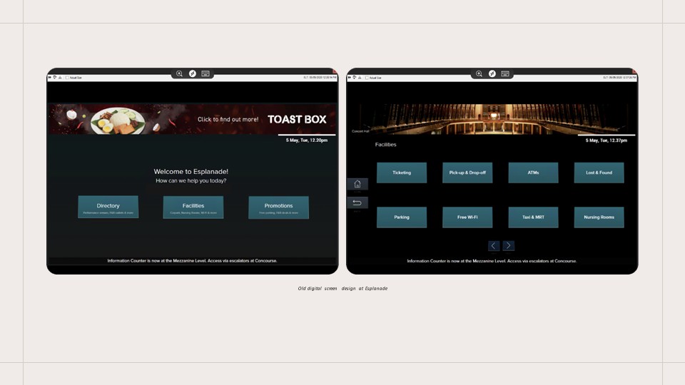
At the time, the only digital touchpoint was a screen placed deeper inside the building. It displayed a directory, facilities, and promotions, but offered little context for first-time visitors.
This created an opportunity to design a stronger first touchpoint at the threshold.
PROBLEM STATEMENT
Who This Was Designed For
This kiosk was designed for moments when people had little context and low commitment.
Locals who enter the mall but are unaware of the performances happening around them
First-time visitors who don’t know what Esplanade is or where to begin exploring
Passers-by using the building as a walkway
Most of these visitors were not actively looking for information. They were deciding whether to engage at all.
Framing the Design Challenge
From the start, the kiosk needed to help visitors answer a few immediate questions:
Where am I?
What is happening here today?
What can I do right now?
How do I get to where I need to go?
It also needed to work across a wide range of physical situations, including wheelchair users, elderly patrons, and people engaging from a distance.
RESEARCH & FINDINGS
Methodologies
Research Objective The goal of our research was to deeply understand who our visitors are, what their goals, needs, and the context of their visits are. We aimed to identify their pain points and motivations and uncover opportunities to enhance their start-to-end journey at Esplanade. A critical part of this research was to determine how the digital kiosk could address these needs and improve the overall visitor experience.
To achieve a comprehensive understanding, I have employed a mixed-methods approach combining both primary and secondary research.
PRIMARY RESEARCH
User Interviews
The primary goal of interviewing 5 potential users was to understand visitor behaviors in finding places of interest while traveling. These interviews aimed to reveal their motivations, preferences, and challenges to refine the digital kiosk's features, enhancing the experience for Esplanade’s visitors.
PRIMARY RESEARCH
Stakeholder Interviews
The stakeholder interviews provided essential insights that informed the development of the digital kiosk, ensuring it meets the multifaceted needs of Esplanade’s operations and marketing efforts. This collaborative approach helped tailor the kiosk features to enhance visitor engagement, promote offerings effectively, and support the venue’s strategic marketing initiatives.
SECONDARY RESEARCH
Visitor Research
I analysed past visitor research conducted at Esplanade to understand historical visitor behavior patterns, preferences, and feedback. This review helped identify consistent trends and pain points in visitor experiences over time, guiding the focus on necessary enhancements for the kiosk.
SECONDARY RESEARCH
Kiosk Experience and Wayfinding Studies
I studied kiosk designs in Singapore malls and examined case studies from solutioning companies to identify best practices and innovative features.
RESEARCH & FINDINGS
Key Findings
Visitors decide quickly Clear, uncluttered displays help users quickly find what’s relevant, whether it’s events, shops, or directions.
“I will check out the place, usually do a quick Google check or check out on any information nearby to see if it’s worth staying”
Wayfinding created uncertainty
Esplanade’s unique architecture makes navigation challenging for newcomers and regulars alike. Maps must be visible, contextual, and tailored to the kiosk’s location so visitors can confidently find their way.
“The layout here is really confusing, sometimes Level 2 is Level 1 on another side”
Real-time information drives relevance
Users expect to see what’s happening now and what’s coming up. Showing only current and upcoming events keeps the experience relevant and engaging.
“I just want to know what’s going on right now or soon since I’m already in the area.”
Physical comfort shaped engagement
Reach, legibility, and posture affected whether people interacted at all. Features like adjustable screen height, prominent accessibility buttons, and adherence to WCAG 2.1 AA standards.
“Honestly, so many kiosks are impossible to use if you’re in a wheelchair. The screens are always too high or you can’t reach the buttons…”
RESEARCH & FINDINGS
Design Principles
01 Orient first
Give visitors instant context on entry so they understand where they are and what Esplanade offers.
02 Design for “right now”
Prioritise what’s happening now and soon, so visitors can decide quickly without reading long listings.
03 Guide action, not browsing
Reduce friction from discovery to next step, so visitors can move from “I found something” to “how do I get there” in one clear path.
04 Accessible by default
Place key actions within reach and keep content legible from a distance, supporting a range of mobility and eyesight needs.
05 Operational principle
Keep content current without extra staff effort by syncing event and shop information from existing sources instead of managing it manually.
SOLUTION
Early exploration
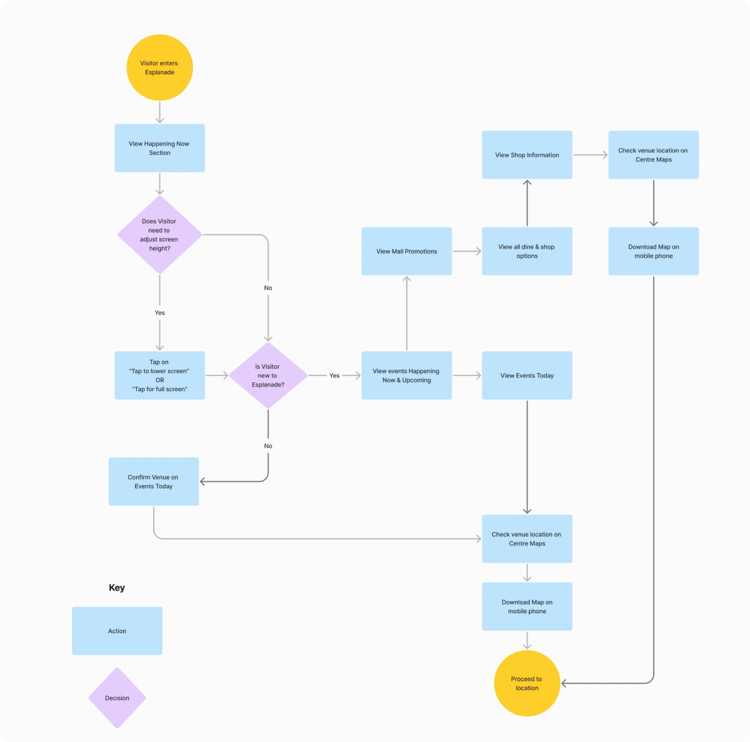
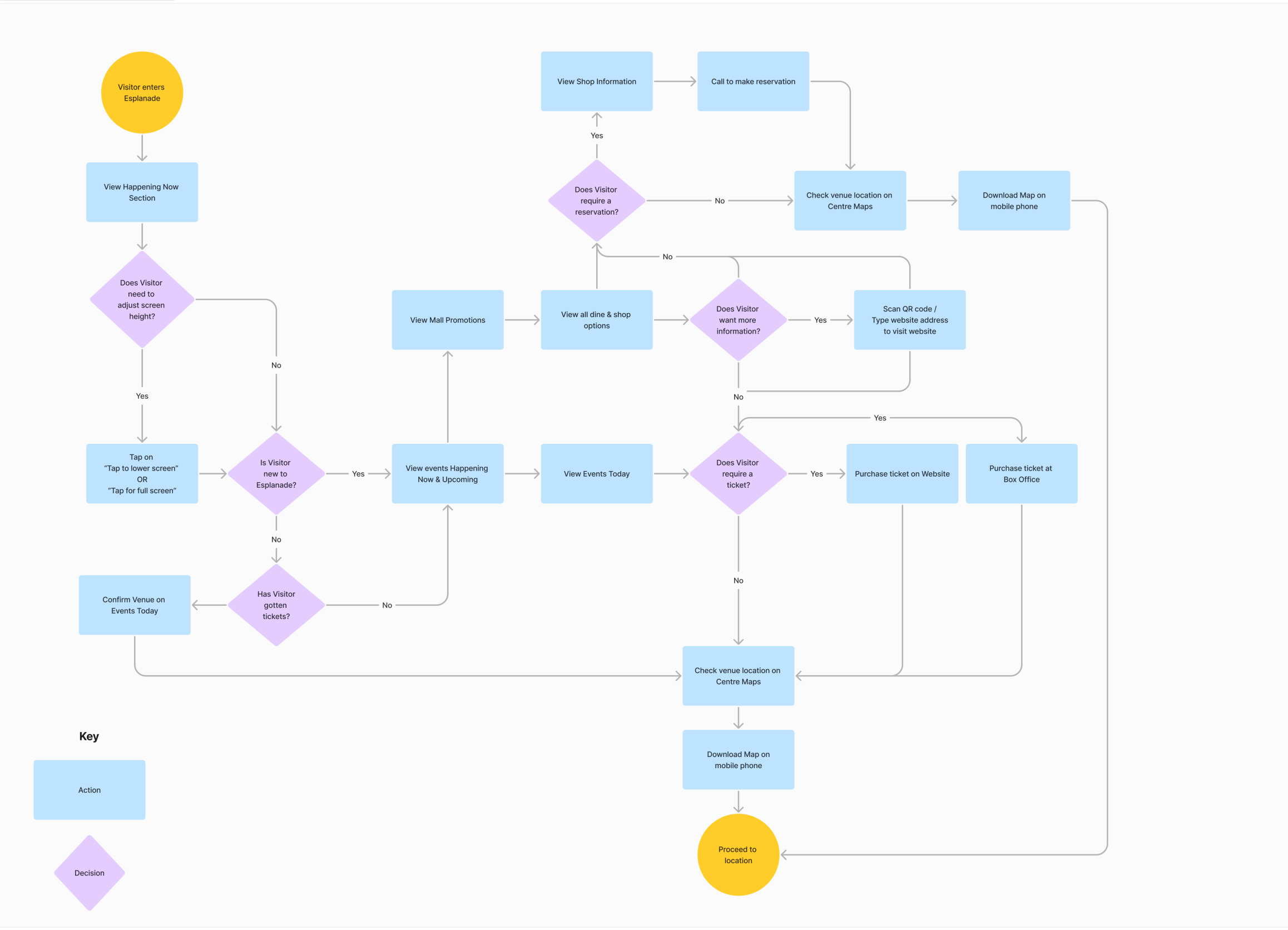
Proposed user flow
Early sketches were used to align quickly with business, marketing, and operations on what the digital concierge should do in its first moments, and what was realistic within scope, priorities, and constraints.
In parallel, I explored public-kiosk behaviours: where the eye naturally lands from several metres away, how hands move in front of a tall display, and what cues need to be visible before someone decides to step closer.
Key decisions
Prioritise time-sensitive content first
Keep supporting content lightweight so the screen stays scannable
Defer detail until users show intent
Display rule If there are no ongoing or upcoming events, the home screen prioritises mall promotions.
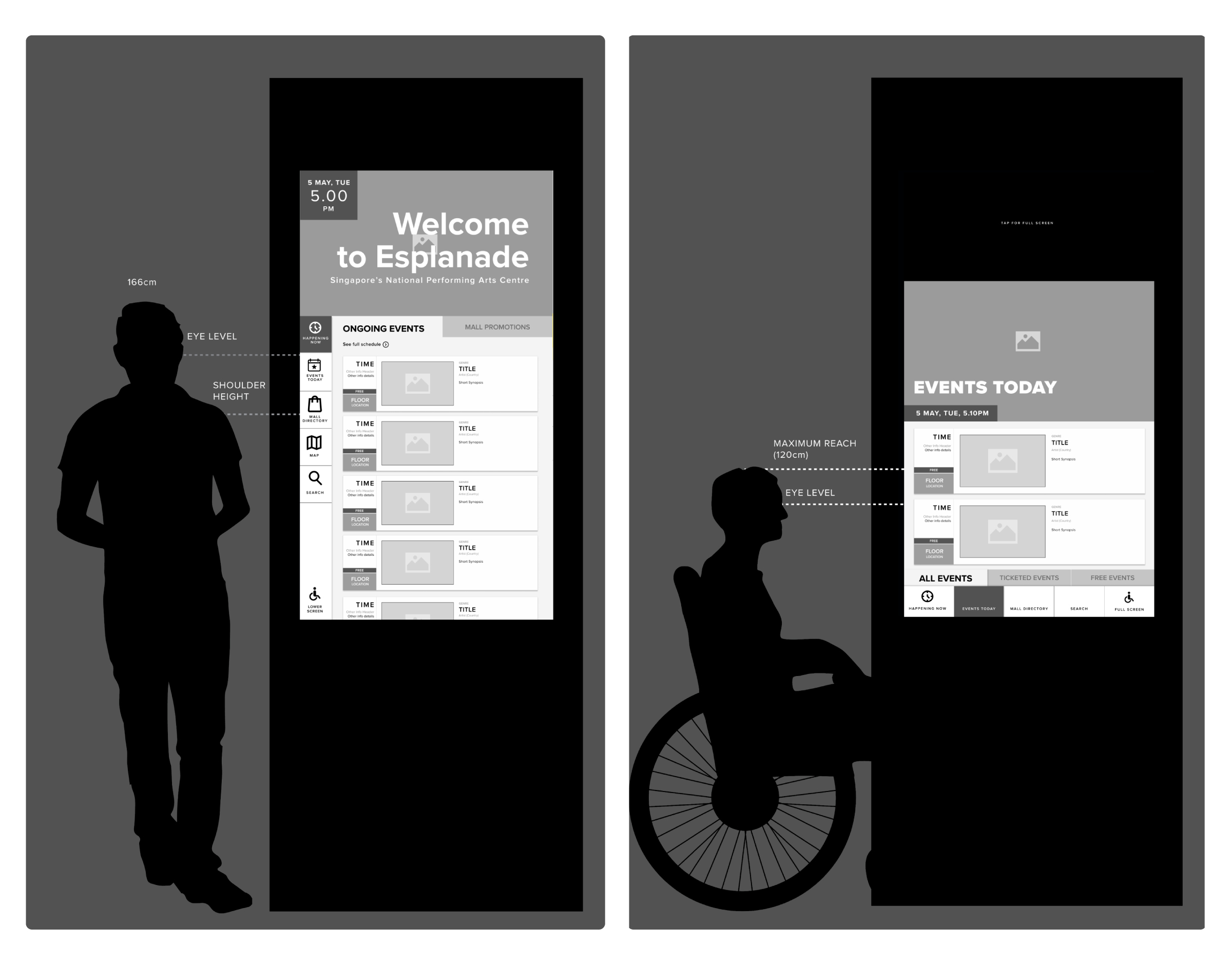
First structure and accessibility zones
Element Sizing & Placement
I mapped where eyes and hands naturally fall for standing and seated users. This guided placement of navigation and primary actions within comfortable reach, while keeping key information at eye level.
Accessible Reach Zones
Accessibility was built into the structure from the start. Essential actions were positioned within a reachable zone for wheelchair users to reduce strain and missed taps.
SOLUTION
Usability Testing
After internal review of the lo-fi wireframes, I built an interactive hi-fi prototype using Esplanade’s brand styles and real imagery. This helped usability testing feel closer to the actual installation, especially for scanning behaviour and content density.
I ran 10 guerrilla sessions using an iPad prototype to validate first impressions, time-based discovery, wayfinding confidence, and accessibility assumptions.
Core tasks What do you think this place is? Find something happening now. Find a place to eat. Find your way to a venue.
Revised User Flow
With feedback from usability testing, I refined the user flow and reworked the interface to better match how people searched, scanned, and recovered from mistakes.
Key refinements after testing
Simplified the navigation structure so visitors could reach key sections quickly and recover from wrong taps.
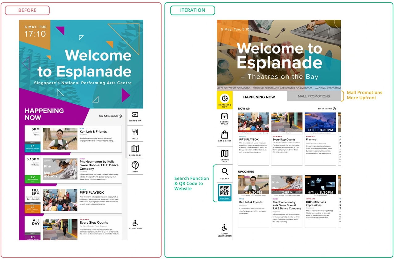
Added search to support direct lookups for visitors who arrived with a specific event, venue, or tenant in mind.
Reworked event discovery into time-based views so people see events happening at a glance.
Linked discovery to wayfinding using the Centre Map and QR handoff, so visitors could move from browsing to navigation and continue on their phone.
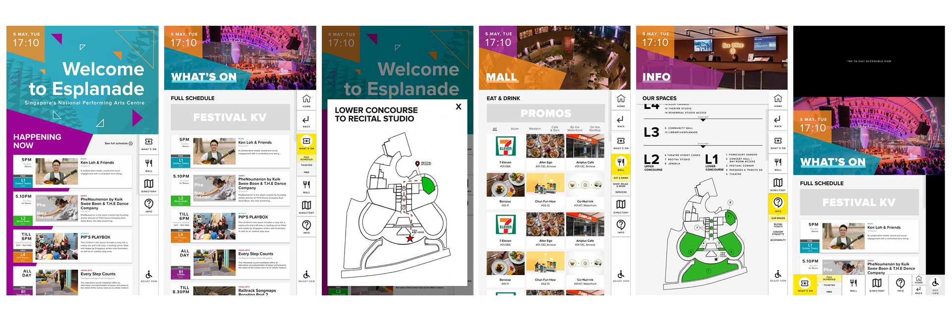
Designing Arrival
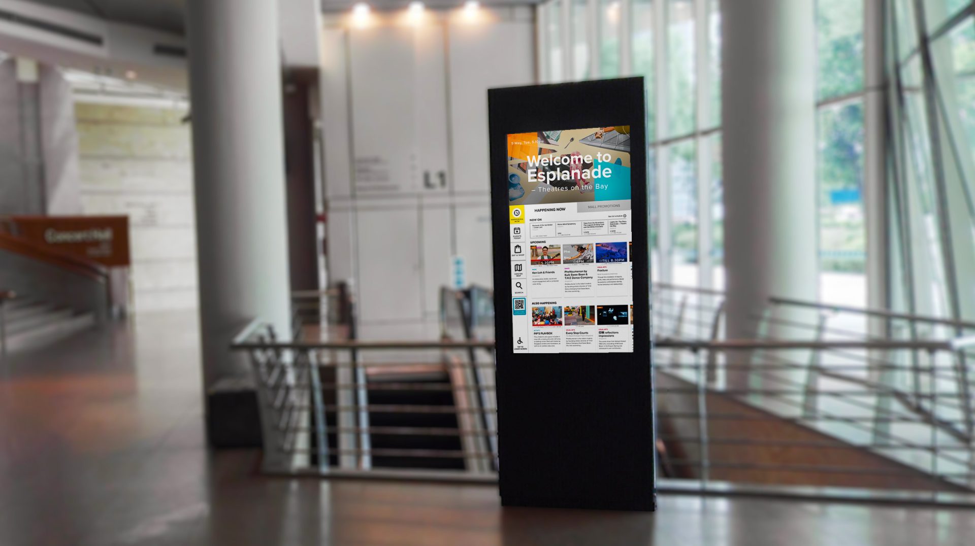
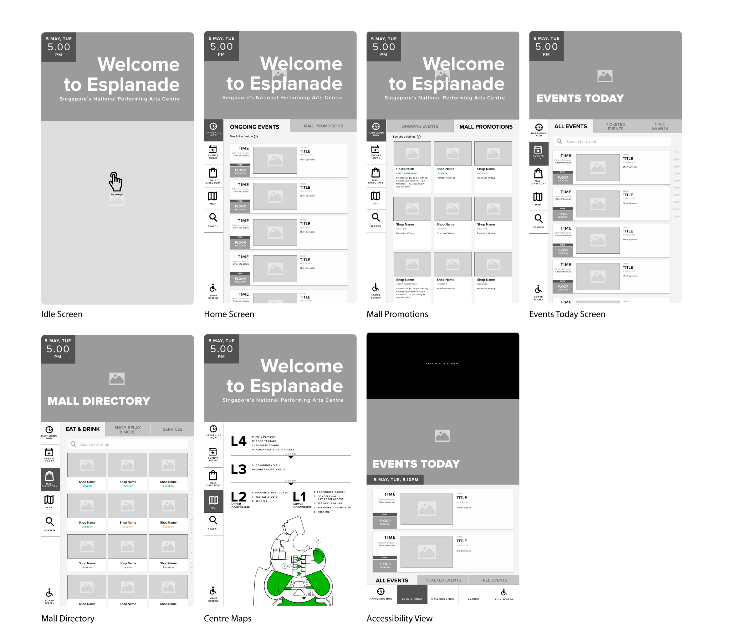
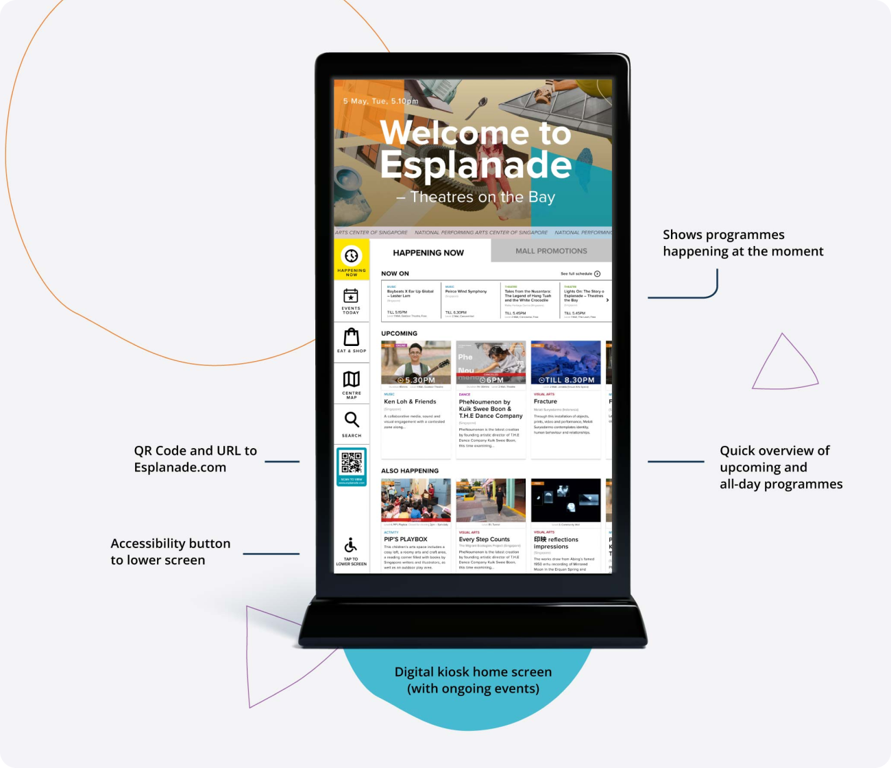
01. Welcome to Esplanade – Theatres on the Bay
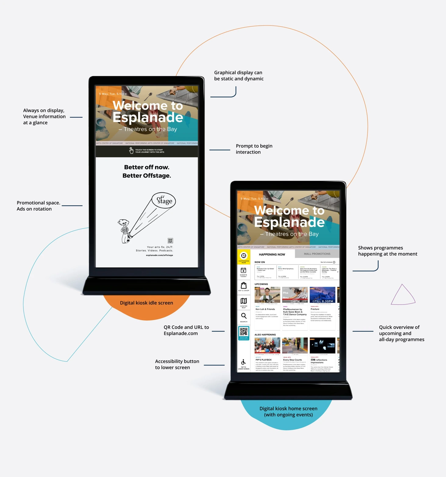
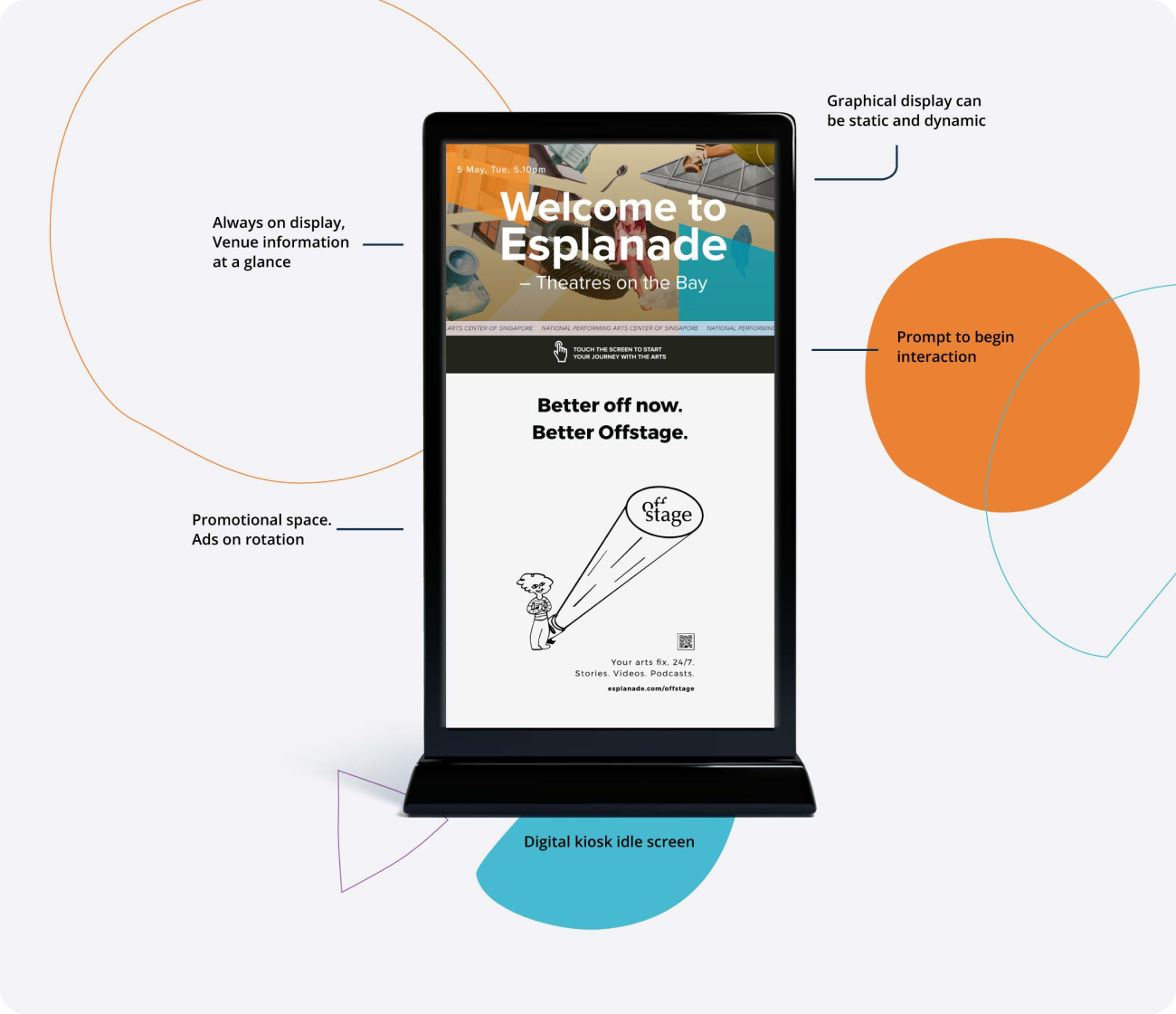
The digital kiosk was designed to create a clear sense of arrival, so visitors know where they are the moment they step in. After inactivity, it returns to an idle or home state so each new visitor starts from a clear, welcoming entry point.
On the first interaction, visitors will be informed of what Esplanade has to offer, highlighting events and promotions that are ending soon.
Designing Navigation
Navigation needed to work for first-time visitors in seconds. Based on testing, I simplified the menu, clarified labels, and shifted key controls to reduce uncertainty and speed up scanning.
Navigation placement
Moved navigation to the left to match common scan patterns and reduce re-orientation time.
Simplified hierarchy
Removed nested sub-menus after testing showed accidental taps and uncertainty about where content lived.
Clearer labels
Renamed labels based on how visitors described their goals during testing.
Card tiles
Replaced long lists with card tiles to reduce reading load and support faster scanning.
Search Function
Added for visitors who arrived with specific intent and wants to find out details specific to event or venue.
QR Handoff
A QR code and a URL for Esplanade.com will be prominently displayed for visitors who wish to explore more information online. This will also provide an alternative for visitors to make any ticket purchases.
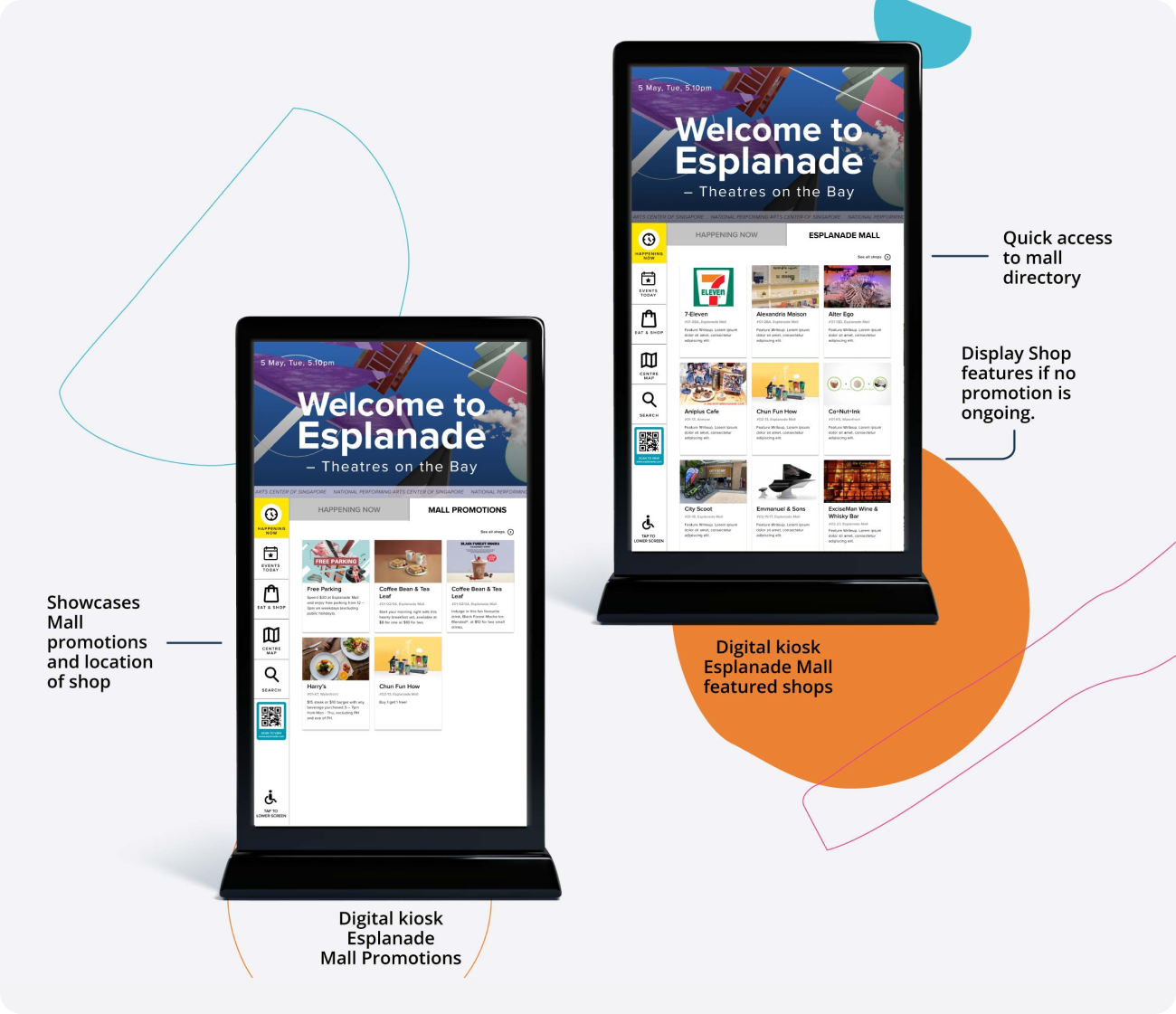
Mall Promotions on Homepage
Increased visibility for visitors, to help tenants promote their product and offerings.
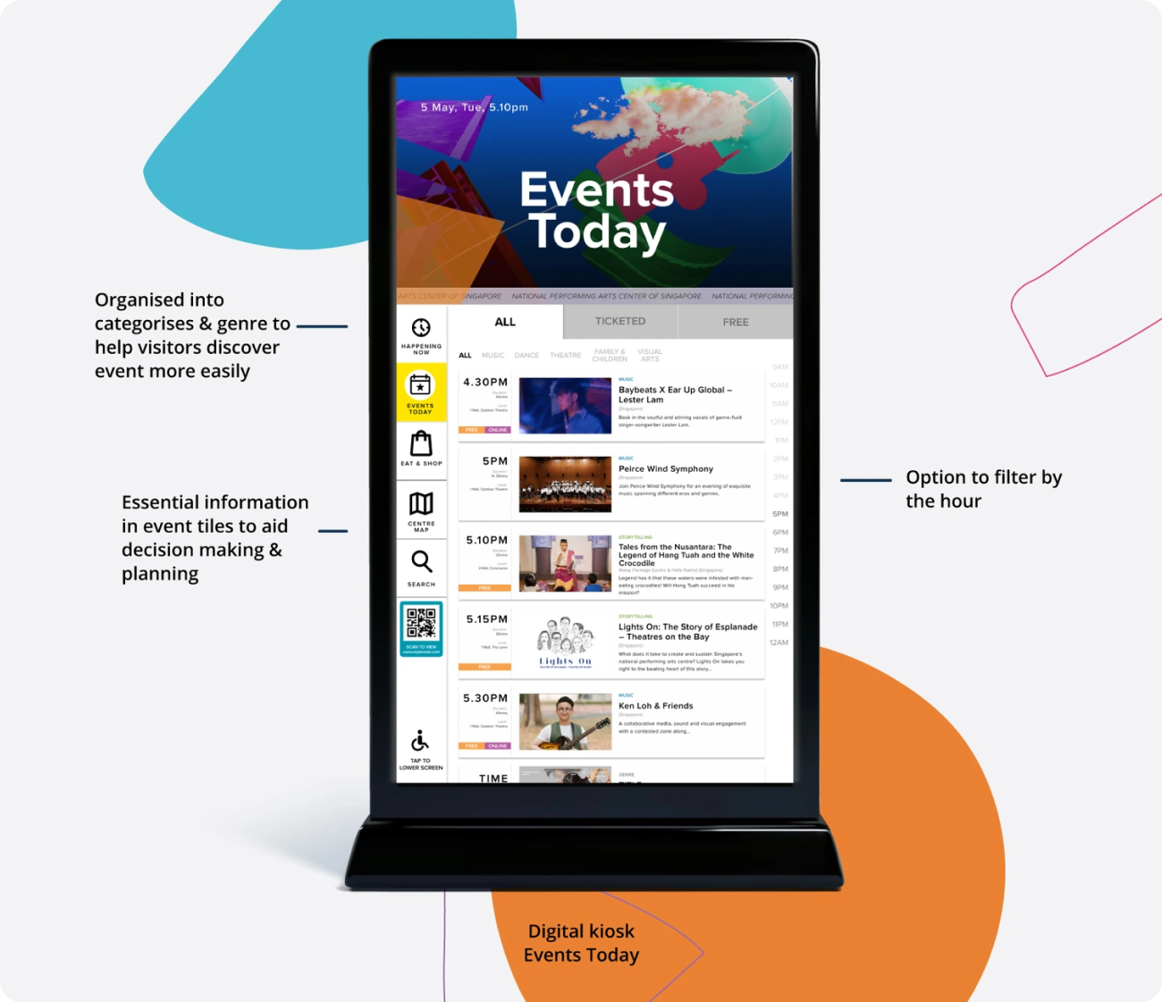
Time-based Event Discovery
During testing, visitors wanted to know what they could do at the current moment, without scrolling through long listings. The improved design allows Visitors can scan quickly and decide quickly.
‘Happening Now’ groups live content into clear time states
Now On shows events currently in progress, with end times to help visitors judge whether it’s still worth catching
Upcoming highlights what starts soon
All-day appears when there are no time-sensitive events, so the screen stays useful throughout the day
Events Today supports planning across the day
Filters for All / Ticketed / Free, plus hour-based filters
Tiles surface decision-critical details first: start time, duration, location, genre, artist, and “Free” or “Online” tags where relevant
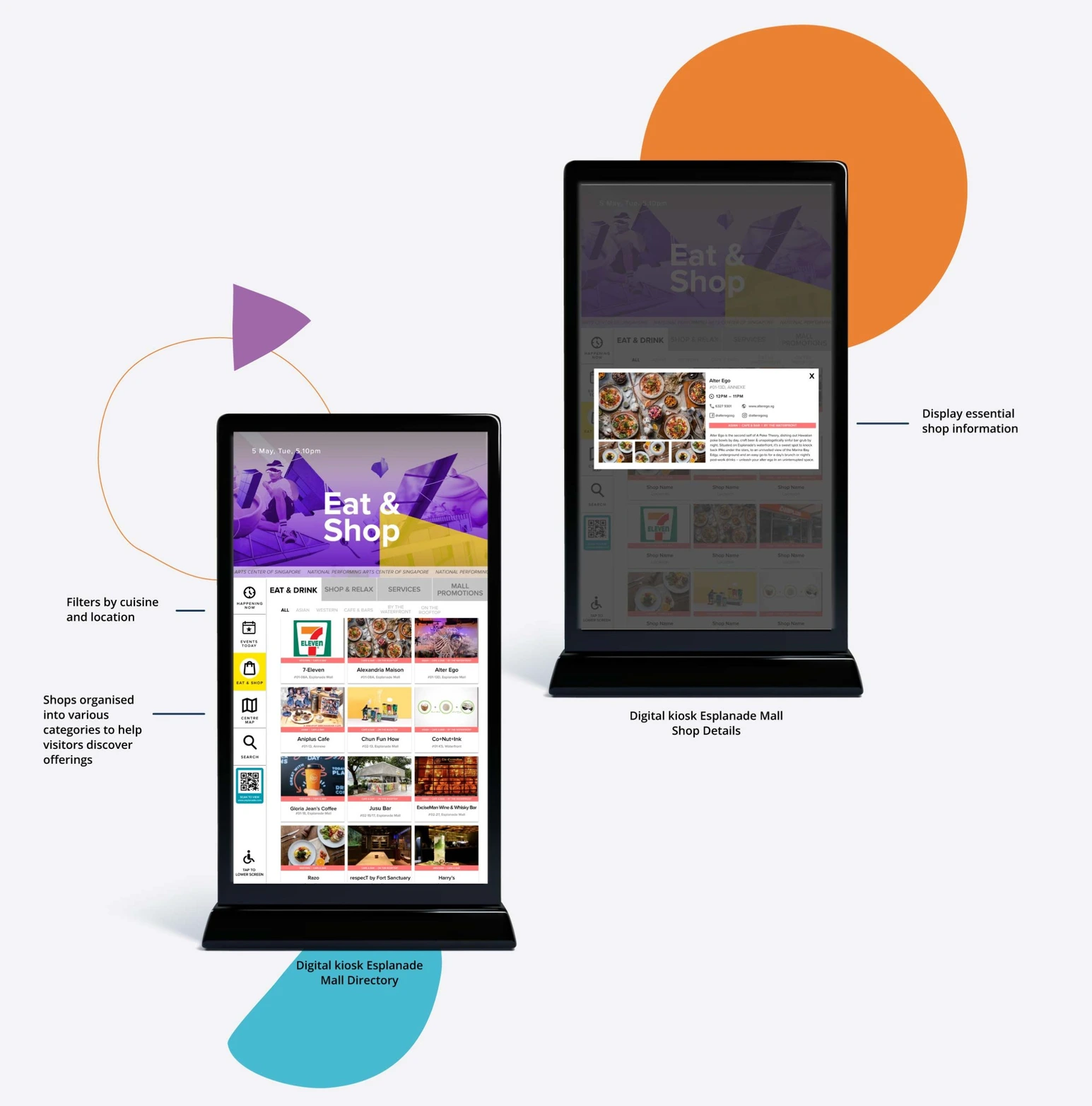
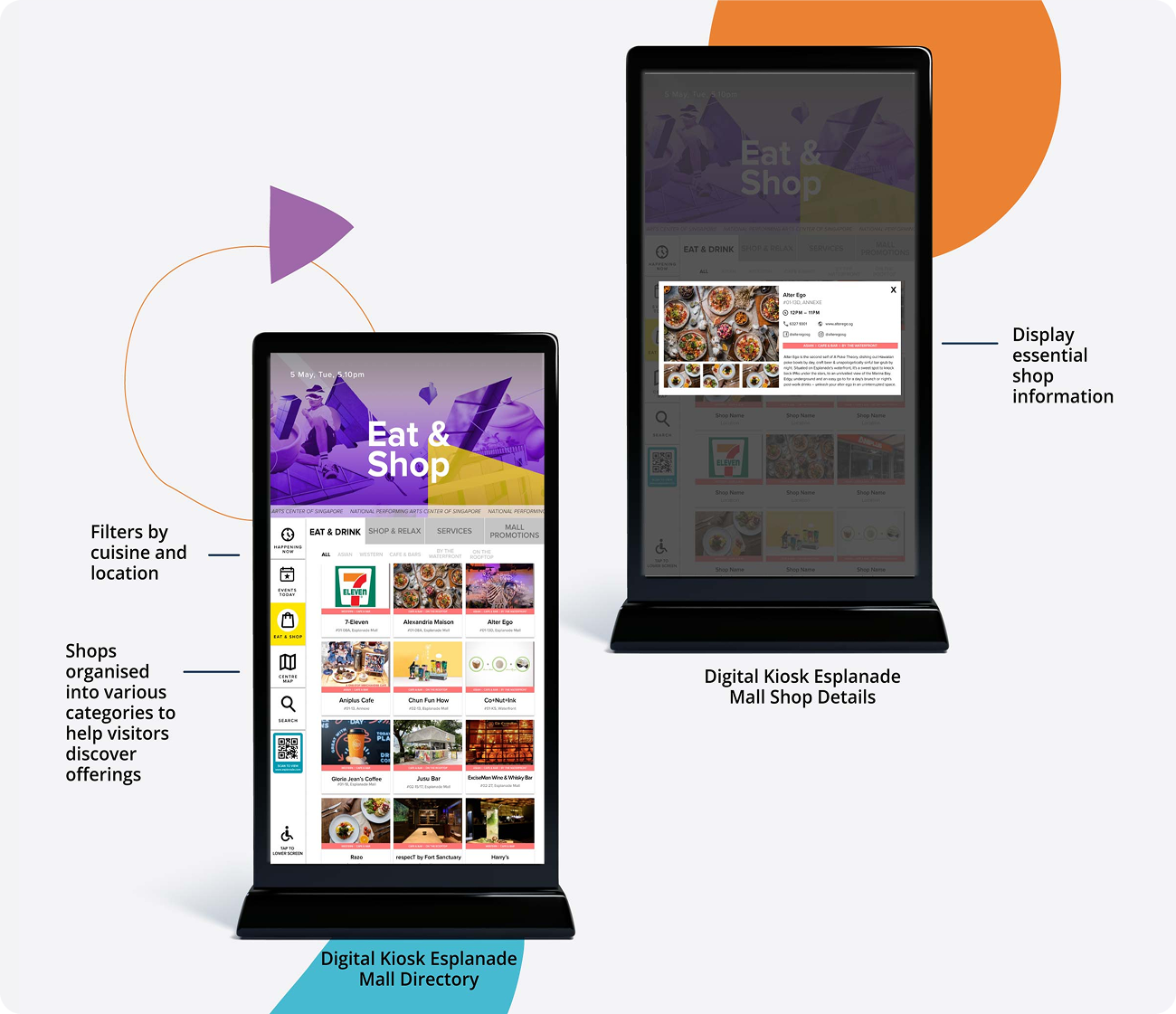
Mall Discovery
Promotions, when available Mall promotions highlight deals and seasonal call-outs that encourage exploration.
Fallback, when there are no promotions The kiosk switches to featured shops and restaurants, so the screen stays useful even on quieter days.
Directory The directory groups tenants into four categories, with filters (cuisine, genre, location) to help visitors narrow down quickly without deep browsing.
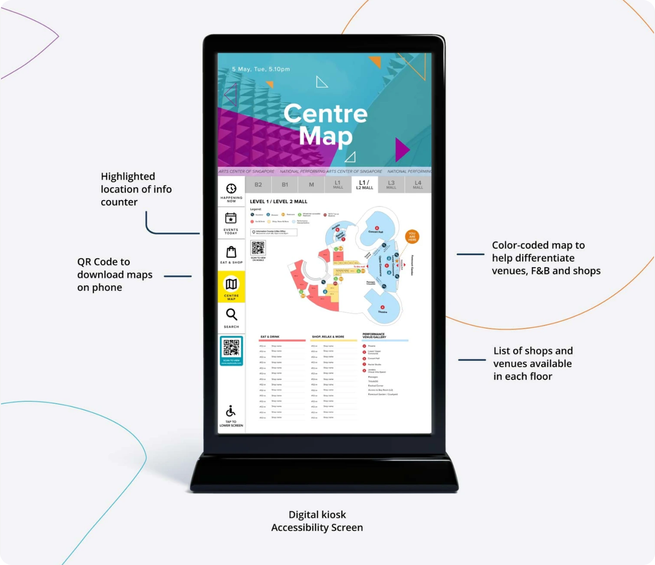
Centre Map and Wayfinding
Centre map The map uses legends and universal icons to mark amenities clearly, with colour-coded zones to differentiate dining, retail, and performance venues. Key services such as the information counter and box office are made easy to spot.
Constraint and workaround Since live navigation was out of scope, the kiosk includes a QR code so visitors can download the map to their phone and keep it with them while walking.
Accessibility Considerations
The kiosk was designed to be accessible to as many visitors as possible, regardless of mobility needs.
Primary actions (including QR) were placed within reachable height for wheelchair users (≤120cm).
Essential information sits at eye level to reduce neck strain and minimise unnecessary scrolling.
The large screen size supports legibility from at least 5 feet away, helping visitors with poorer eyesight.
Typography and colour contrast were checked against WCAG AA targets during design QA to maintain readability across different lighting conditions.
Outcome & Future Considerations
Two months after launch, we saw an estimated ~15% uplift in brand awareness and visitor dwell time (based on internal tracking and post-launch feedback)
Impact of COVID-19 Usage later declined as COVID-19 heightened hygiene concerns around shared touchpoints. The kiosk was subsequently reassessed alongside the rollout of a new Content Management System, with the aim of integrating a more robust, end-to-end wayfinding system across Esplanade.