UI UX

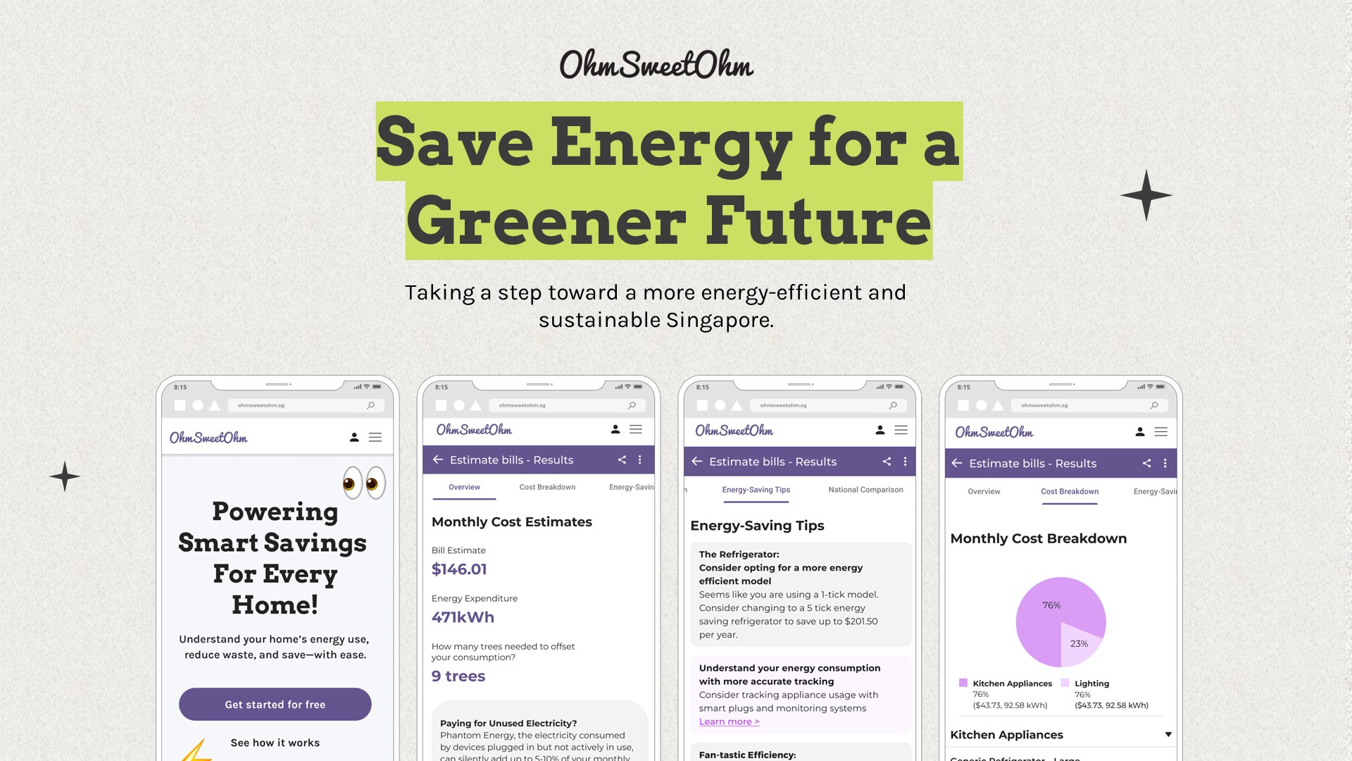
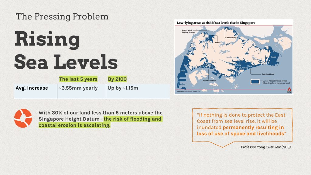
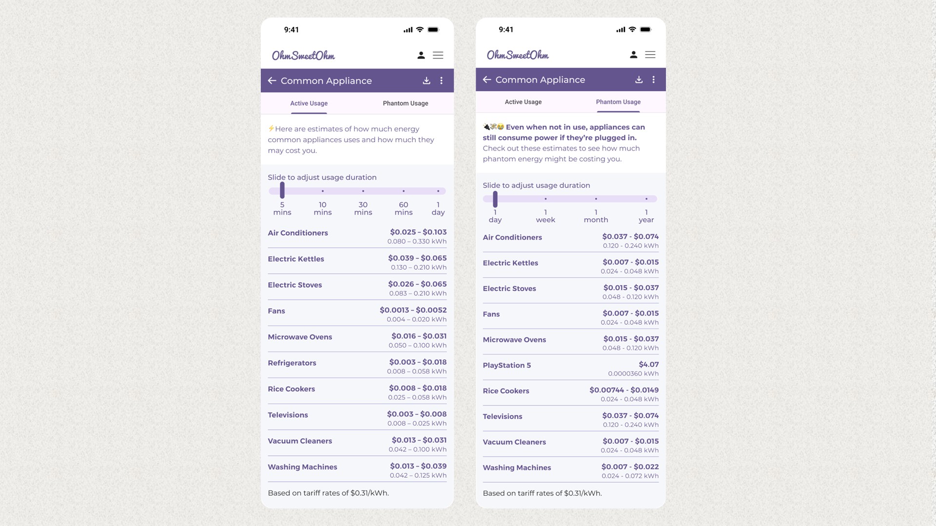
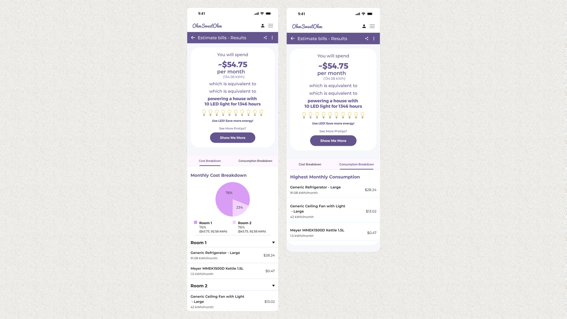
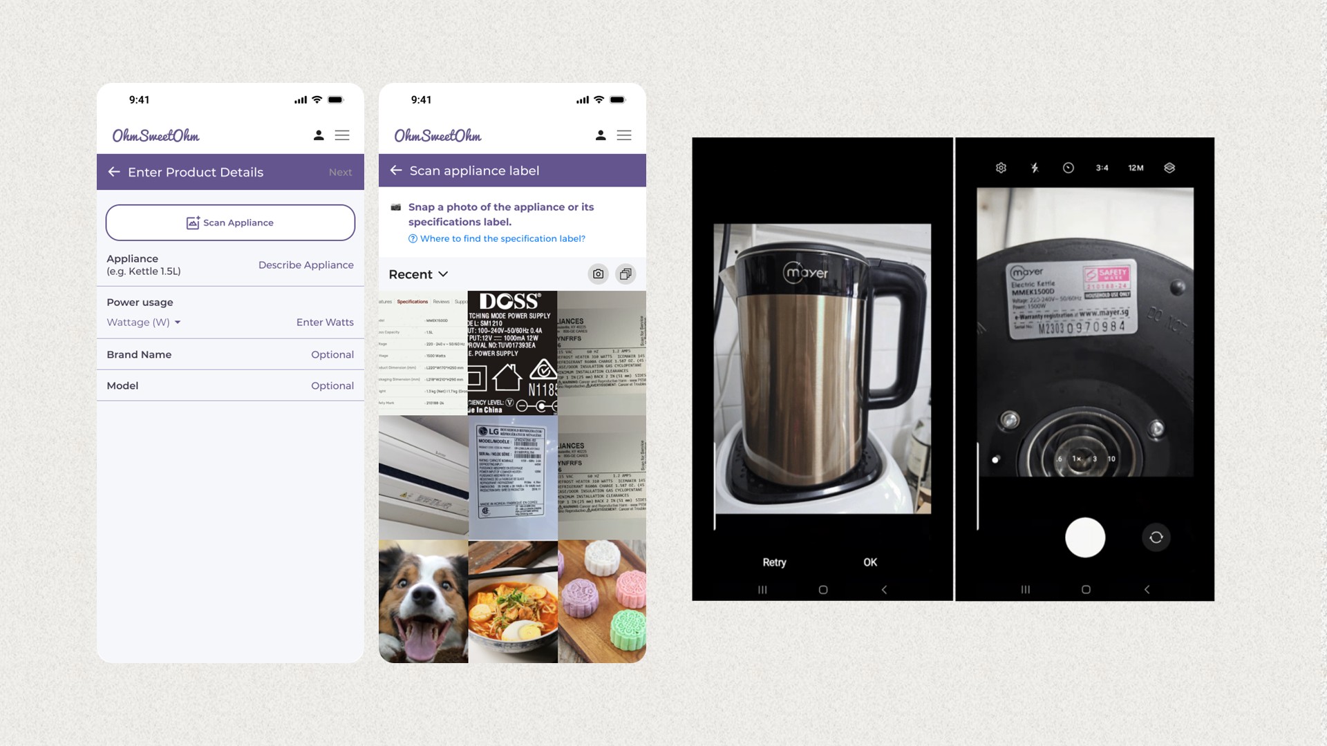
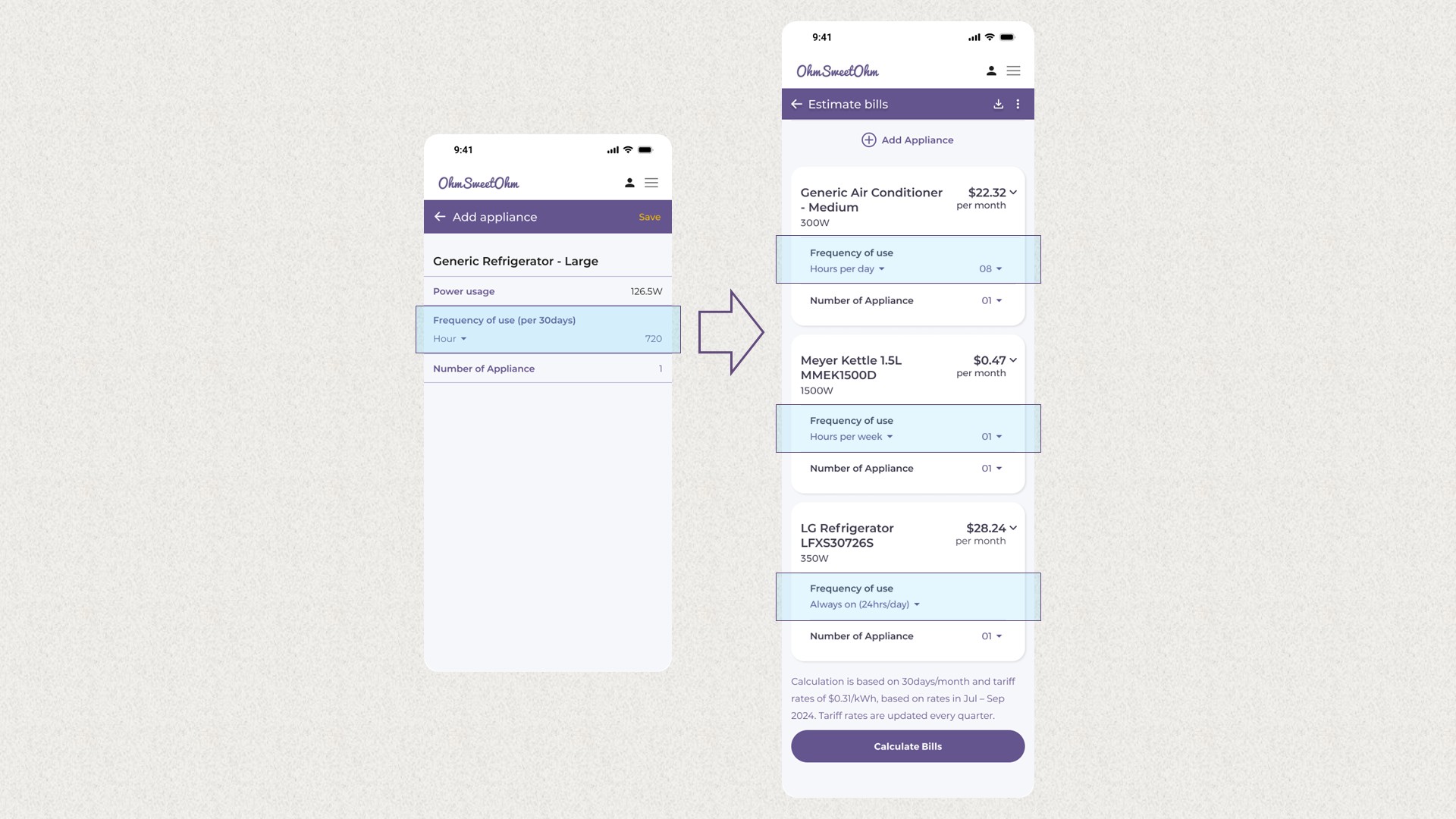
OhmSweetOhm: Making household energy costs visible for better everyday decisions
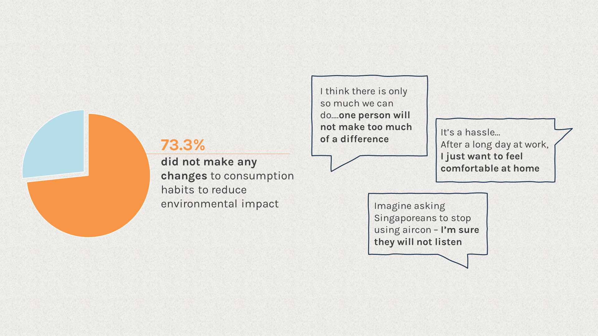
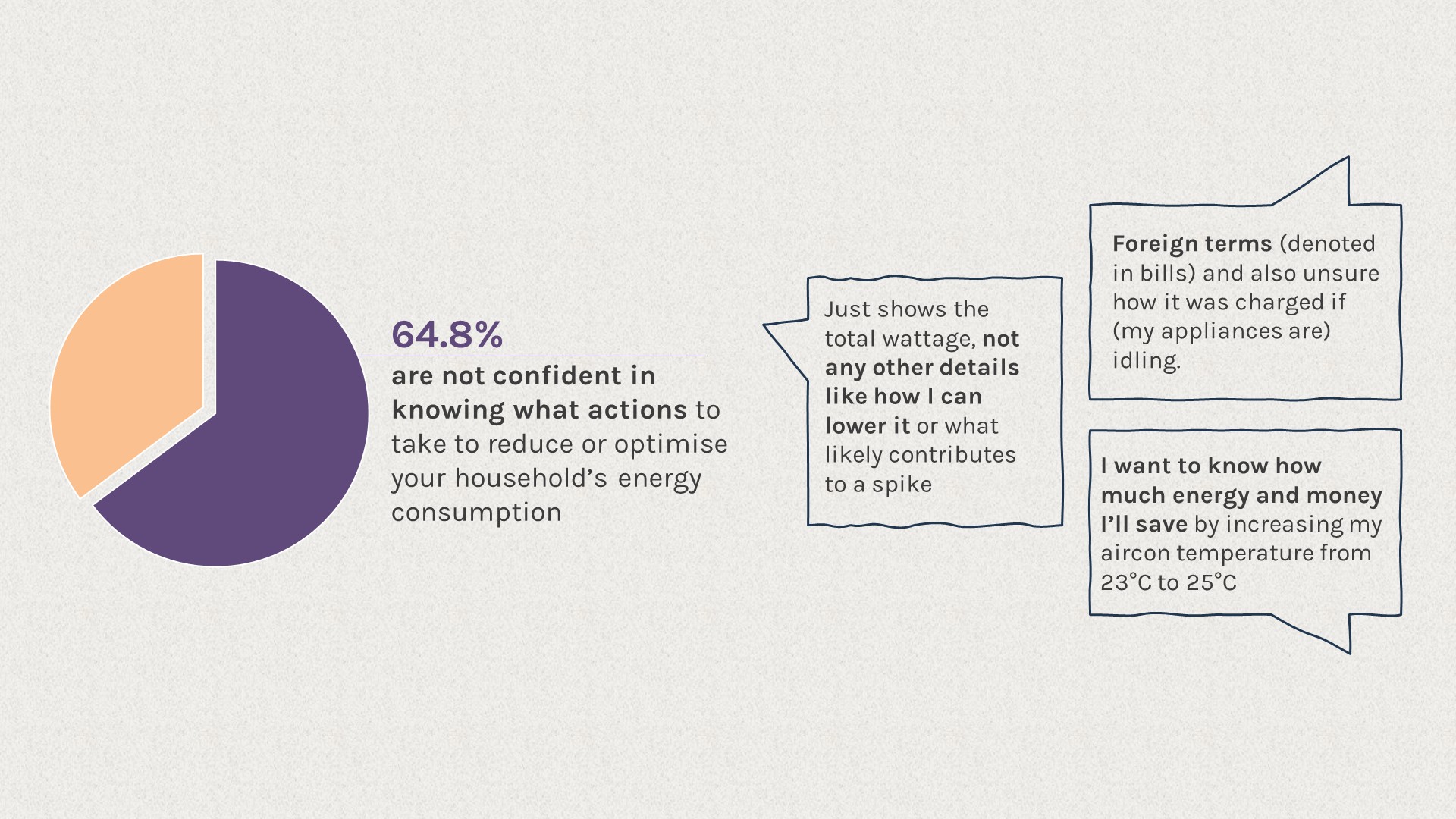
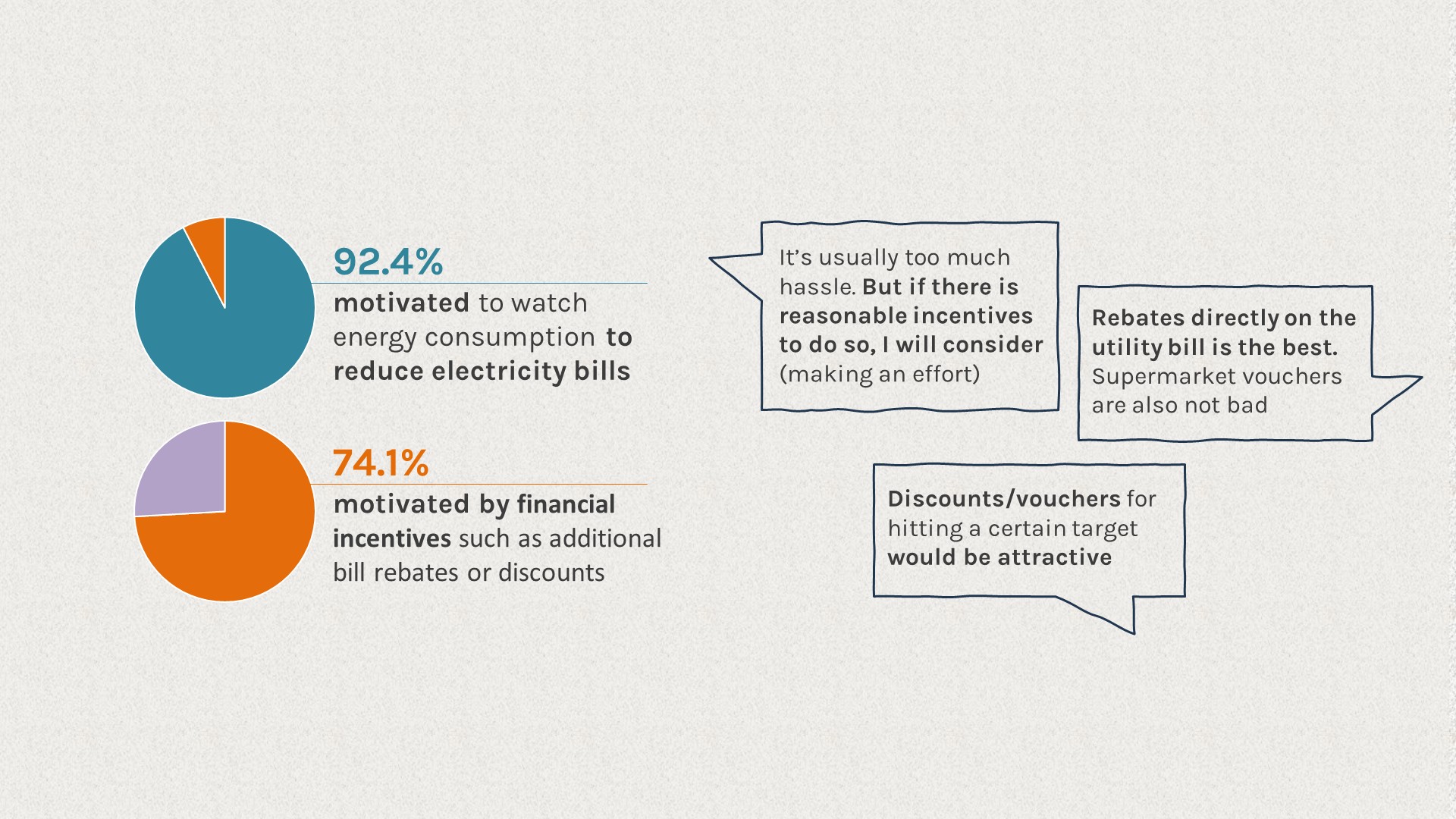
AI-powered web calculator for estimating appliance-level electricity costs in Singapore households. Open Government Products Build for Good 2024 Winning Project.

Task

User Research, Wireframing & Prototyping, Hackathon

  • Design

    UI/UX Design, Case Study

  • Role

    UX Designer & Researcher

Product Design, UI, UX

OhmSweetOhm: Making Household Electricity Visible

This was a winning project developed as part of Build for Good 2024, a 1-month Open Government Product Hackathon.

Role Project Lead, UI/UX Designer 
Collaborated with three Computer Science students and one aspiring UX Designer
I led the project across problem framing, research, product direction, interaction design, prototyping,
and testing.

Scope User Research, Usability Testing, User Flow, Wireframing & Prototyping, Interface Design

BACKGROUND

About this project

OhmSweetOhm is a mobile-optimised, AI-powered web calculator that helps Singaporean households understand the cost of electricity usage of appliances.

The product is designed to:

• improve awareness of running costs
• support better household habits
• inform appliance purchasing decisions

View product introduction video on Facebook →

Demo Video:

THE PROBLEM

Electricity is affordable?

Electricity is part of everyday life in Singapore, but seems to be rarely questioned.

For many households, comfort feels affordable. Bills are manageable. Appliances run quietly in the background. Electricity usually only becomes visible once a month, when a single total appears on a bill. By then, there is little connection to what actually led to that number.

When electricity feels affordable, it is easy to use without thinking. Small everyday habits may feel insignificant on their own, but when repeated across millions of homes, they quietly scale.

Climate impact feels even further removed. While people are aware of climate change in the abstract, it rarely comes to mind during everyday electricity decisions. Individual actions feel negligible when large industries seem responsible for most of the damage…

But they do add up!

I personally believe how electricity is used at home often sets the baseline for how it
is used elsewhere. A habit of leaving air-conditioning or lights running at home carries
into offices, where the same behavior is repeated across larger environments and
longer hours.

Electricity may feel affordable, but mindless consumption carries a growing cost.

Singapore’s climate projections suggest that if current energy consumption patterns continue, the country will face higher average temperatures, more frequent extreme weather, and rising sea levels that place low-lying areas at increasing risk of flooding.

These changes will gradually reduce usable land and make everyday conditions more volatile.

RESEARCH & INSIGHTS

Insights from the Ground Floor

We were set out to explore how a product might help people care more about energy consumption at home, and make sound decisions to positively impact our climate.

This raised a set of questions we needed to investigate:

  • What actually motivates people to pay attention to electricity?
  • What makes it easy to ignore?
  • Where is the largest inertia to change?
  • And where might design realistically support better everyday decisions?

To understand how people currently relate to electricity usage, we conducted:

  1. A survey with 105 respondents
  2. In-depth interviews with 14 participants

Participants were primarily homeowners who pay their own household utility bills. Most were tech-savvy and in their late 20s to 50s.

Key Finding #1. People care, but comfort often comes first

Our first key finding Shows that people are concerned about climate changes, but do not have the motivation to take action

In fact, 73.3% of respondents admitted they’ve made no changes to their consumption habits to reduce their environmental impact.

When asked why, many shared sentiments like lacking confidence that their actions will make a difference or are unwilling to sacrifice personal comfort. 

“There is only so much we can do….one person will not make too much of a difference”


“It’s a hassle… after a long day at work, I just want to feel comfortable at home.”

“Imagine asking Singaporeans to stop using aircon — I’m sure they will not listen.

Key Finding #2. People lack the knowledge and tools to make informed decisions

Our second key finding highlights a lack of knowledge and tools as a major barrier to action.

64.8% respondents expressed that they are not confident about the actions to take to reduce or optimize their household’s energy consumption.

When asked about their challenges, many shared that they were not equipped with the knowledge to understand how much each appliance is costing them or the impact of adjusting their lifestyle.

“(Utility bills) just shows the total wattage, not any other details like how I can lower it or what likely contributes to a spike.”


“Foreign terms (denoted in utility bills) and also unsure how much (my appliances) cost while idling.”


“I want to know how much energy and money I’ll save by increasing my aircon temperature from 23°C to 25°C.”

Key Finding #3. Incentives motivate action, but only if minimal effort is required

Click image to view in detail

Our third key finding reveals that people are motivated by cost savings and incentives, particularly when minimal effort is required.

92.4% of respondents are motivated to monitor their energy consumption if it means reducing their electricity bills.

Additionally, 74.1% expressed that financial incentives like rebates or discounts further encourages action.

These responses highlight that financial benefits are a powerful motivator but changes must also be easy to implement.

“It’s usually too much hassle. But if there is reasonable incentives to do so, I will consider making an effort.”


“Rebates directly on the utility bill is the best (motivator). Supermarket vouchers are also not bad.”


“If (the solution) made it fun and like a contest to see how much you can save, it would be helpful. If it could track points and provide rewards, I believe it would be motivating”

IDEATION

Exploring the Solution Space

With our findings, it became clear that not many people have taken action to reduce their environmental impact through everyday electricity use. In a stressful society, it’s understandable that comfort takes priority especially since electricity costs stay invisible until the bill arrives.

The encouraging part was that people weren’t closed off. Many were willing to learn, especially when the payoff is more visible, whether that meant visible impact or meaningful incentives.

This shaped our direction. The product needed to bring appliance-level costs upfront, stay convenient to use, and be informative enough to guide decisions while showing impact in a way people could relate to.

In future iterations, we would also explore a lightweight reward system to help sustain motivation over time. Healthy365 is a useful reference point for making participation feel rewarding and easy to maintain. PS: My mother-in-law and her siblings (and their families) are subscribed to staying active because of Healthy365!

Hardware-Based Tracking

Image of Ampotechs Smart Device, taken from A*STAR SIngapore

We first explored smart meters as a potential solution. In theory, real-time tracking at the meter level could provide accurate, continuous visibility into household electricity consumption with just a one-time setup.

With reliable, real-time data, users could receive timely feedback on their consumption, compare performance over time, and be rewarded for reducing usage without having to manually track or adjust anything manually! 

During this exploration, we came across the Household Demand Response Pilot by the Energy Market Authority (EMA), developed in partnership with SP Group (one of Singapore’s biggest electricity provider). 

The pilot enables households with AMI smart meters to reduce electricity consumption during high-demand periods through “live” events. Participating households were provided with smart plugs and rewarded for reducing usage during these periods.

Programmes like this require deep integration with utilities, regulatory backing, electrical engineering knowledge and significant financial resources; conditions we could not realistically replicate or compete with, nor is there a need to.

Without support, hardware installation, upfront costs, and reliance on external providers made adoption difficult for most households. This directly conflicted with a core research insight: people were unwilling to adopt solutions that required sustained effort or high initial commitment.

This led us to step away from hardware-dependent approaches.

Image of myfitnesspal food tracker, taken from myfitnesspal blog

How about using Aggregated Data?

We then explored whether aggregated data could provide a lower-effort alternative.

We began by searching for publicly available or local datasets that could support appliance-level estimates, but found the information sparse and limited. This led us to consider building the dataset gradually through user-generated input, similar to how nutrition apps rely on shared food databases.

As we went deeper, the problem started to look simpler than the data challenge suggested. Appliance electricity use can be estimated from a small set of inputs:

  • Appliance’s power rating x How long it runs = Total energy expenditure
  • Total energy expenditure x Tariff rate = Total Cost

Many appliances already provide power-related information on their labels. When these values are available, or can be derived from voltage and current, we can generate reasonable estimates with simple calculations.

This reframed the direction. Instead of waiting for well documented databases, we could build the product around meaningful estimation using information that already exists in the home.

PROPOSED SOLUTION

Initial design direction + Usability Test

Our initial design direction focused on making electricity visible at a practical, everyday level.

Based on our research insights, the initial design was built around the idea of reconstructing the household bill from the bottom up, appliance by appliance, as a way to move people beyond a single monthly number and toward a clearer understanding of where electricity & cost was actually going.

We tested this design with 10 participants, including members of the public and Open Government Product staff, using a clickable prototype and short task-based sessions.

Click image to view in detail

Design Note 1: Appliance recording, organised by rooms does not work

Click image to view in detail

Our initial design made it so that users could add appliances and group them by rooms in the home.

This structure was intended to mirror how people naturally think about domestic space e.g. kitchen, bedroom, living room, and to help households locate where electricity was being used. It also allowed users to gradually build toward a fuller picture of household usage over time.

To add an appliance, users manually keyed in:

  • Appliance type
  • Brand and model (to contribute to a searchable dataset for others)
  • Power rating (wattage)
  • Frequency of use based on a 30-day period
  • Number of identical appliances
Click image to view in detail
What worked
Users appreciated having the running cost of appliance shown immediately after entering the data.
 
What didn’t work

Manual entry introduced major friction:

  1. 7/10 participants were unwilling to repeatedly find power labels, key in technical specifications, or estimate a 30-day usage pattern.
  2. 8/10 said they would only record appliances they were curious about or suspected were expensive. Definitely not their entire household.

Design Note 2: Quick estimates for common appliances is not helpful

Click image to view in detail

We introduced a library of common household appliances with two dedicated views:

  1. Active usage: energy consumed while appliances are running
  2. Phantom usage: electricity consumed while devices are plugged in but idle

Users could adjust usage duration with simple sliders to see how small changes in behaviour affected both electricity consumption and monthly cost.

What worked

Participants found it eye-opening to see costs attached to everyday appliances, and many were surprised by phantom energy usage.

What didn’t work

Participants felt the slider-based estimates were too broad to reflect their actual usage, so the numbers didn’t feel actionable. Many also wanted to see only the appliances relevant to their home, instead of scanning a generic list.

Design Note 3: Household comparison may lack data

Click image to view in detail

In our initial design, users could view the following breakdowns after keying in all their appliances:

• Estimated monthly cost
• Estimated energy consumption
• Room-by-room breakdowns
• Highest-consumption appliances

What worked

  • Participants appreciated seeing everything brought together.
  • The breakdowns helped them identify which appliances mattered most, and the recommendations were fun.
  • Participants shared this will be helpful when purchasing new appliances as well

What didn’t work

  • The national comparison breakdown depended heavily on having enough data.
  • Because most participants were unwilling to record their full homes, the household summary often felt incomplete. Users cared more about understanding relative impact than building a perfectly accurate household model.
  • We’ve also gotten feedback on making a stronger connection back to sustainability.
PROPOSED SOLUTION

Product Improvements

We’ve made the following improvements

Improvement #1: Faster and more flexible data capture

AI-assisted image recognition to identify appliances through camera or photo gallery
More options for Frequency of use

The usability test confirmed that people do care once insights are visible. Appliance-level costs, phantom usage, and comparisons sparked curiosity and reflection.

The friction was data entry. Participants were willing to explore insights, but not to spend time collecting information.

So we simplified how appliance details were captured:

  1. Added AI-assisted image recognition to identify appliances or read power labels
  2. Kept manual entry as a fallback for users who prefer it
  3. Provided estimated energy expenditure based on image recognition, when labels weren’t available. The estimated value will offer sufficient insights for people to take action.
  4. Switched to everyday inputs (mins / hours per use, or Always on) instead of estimating usage across a 30-day period and auto-tabulate day inputs into monthly estimates

Improvement #2: Appliance-level comparisons

Click image to view in detail
  1. Designed for partial input
    • Shifted analysis from “whole home” to single appliance-level insights
    • Highlighted top cost drivers among the appliances recorded
    • Kept the experience valuable even when users only track what they’re curious about
  2. Made hidden consumption harder to ignore
    • Elevated phantom energy from a secondary tab into a core insight
    • Quantified both cost and kWh, so “idle power” feels tangible
  3. Added a sustainability lens
    Alongside cost, translated usage into an easy-to-grasp impact cue
(i.e. number of trees to offset consumption)

Improvement #3: More actionable tips and relevant comparisons

Click image to view in detail

This section was garnered the most interest as a number of tips that we are able to provide were things they never knew.

Stronger recommendations and benchmarks supported by AI

  1. Introduced personalised energy-saving tips based on the appliances recorded
  2. Covered behavioural fixes, efficiency habits, and upgrade considerations
  3. Added national comparison for the top cost-driving appliances, so users can quickly see what’s above typical levels
  4. Where available, surfaced an estate-level comparison (optional, if users create an account and provide location context)
Click image to view in detail

With these improvements, users could get useful insight with fewer steps, even if they only recorded a handful of appliances.

The experience also became more motivating through more relevant recommendations, clearer educational cues, and the idea of friendly competition, which mirrors what people already pay attention to in their SP bills and could encourage them to keep an eye on their own usage.

PROPOSED SOLUTION

Prototype

This project is currently on hiatus. To manage AI credit costs, the live demo is offline. Below is the Figma prototype I created prior to development. 

Feel free to try it!

OUR IMPACT THUS FAR

Energy-Saving Challenge

Click image to view in detail

We focused on bringing OhmSweetOhm to the public as a free-to-use, low-barrier way for households to better understand their electricity habits.

To kickstart adoption and collect real-world feedback, we launched an energy-saving challenge for early users. Participants submit two short surveys and two consecutive months of electricity bills to validate changes in consumption. Those who demonstrate savings receive up to $20 in NTUC vouchers.

Click image to view in detail

To support the pilot, we ran a small marketing push. Our team spent a day at Tampines MRT, speaking with members of the public about the product and how it could help them save on bills while earning rewards. 

We also set up Instagram and LinkedIn pages to share product updates, challenge information, and bite-sized educational posts about electricity use and environmental impact.

By the end of the challenge, we had 53 sign-ups and 20 pledges for the challenge, and gathered positive, actionable feedback from early users.

Many shared that they could better understand their electricity consumption patterns and had started taking steps to reduce their usage.

Future Considerations

Future Considerations

Click image to view in detail
  1. Gamification and rewards
    We want to introduce a lightweight reward system to sustain engagement over time. By pairing tangible rewards with progress tracking and tailored challenges, the aim is to make energy conservation easier to stick with and rewarding enough to return to.
  2. Appliance comparison
    We also plan to expand the appliance comparison feature to support better purchase decisions. The tool would allow users to compare similar appliances by estimated running cost, energy usage, and environmental impact, so they can weigh long-term efficiency alongside upfront price.

Closing Statement

Click image to view in detail

OhmSweetOhm is built for early learners, helping them understand their own energy use through simple, actionable insights.

Over time, the aim is to go beyond individual behaviour and build confidence. The long-term hope is that some users become more informed, share what they learn, and advocate for better energy habits within their households and communities.

Back